Yahoo! Membership
Redesign Project
Overview
Yahoo Membership (or Yahoo account) is the identity within Yahoo, providing a single login to access multiple services like Yahoo Mail, Yahoo Finance, Yahoo Sports, and Yahoo News.
My Contribution
Collaborated with engineering on API feasibility
Built wireframes & high-fidelity prototypes
Focus on
Sign-up / login flows
Account recovery (password reset, security)
User data and privacy controls
Cross-platform consistency (web, mobile, tablet)
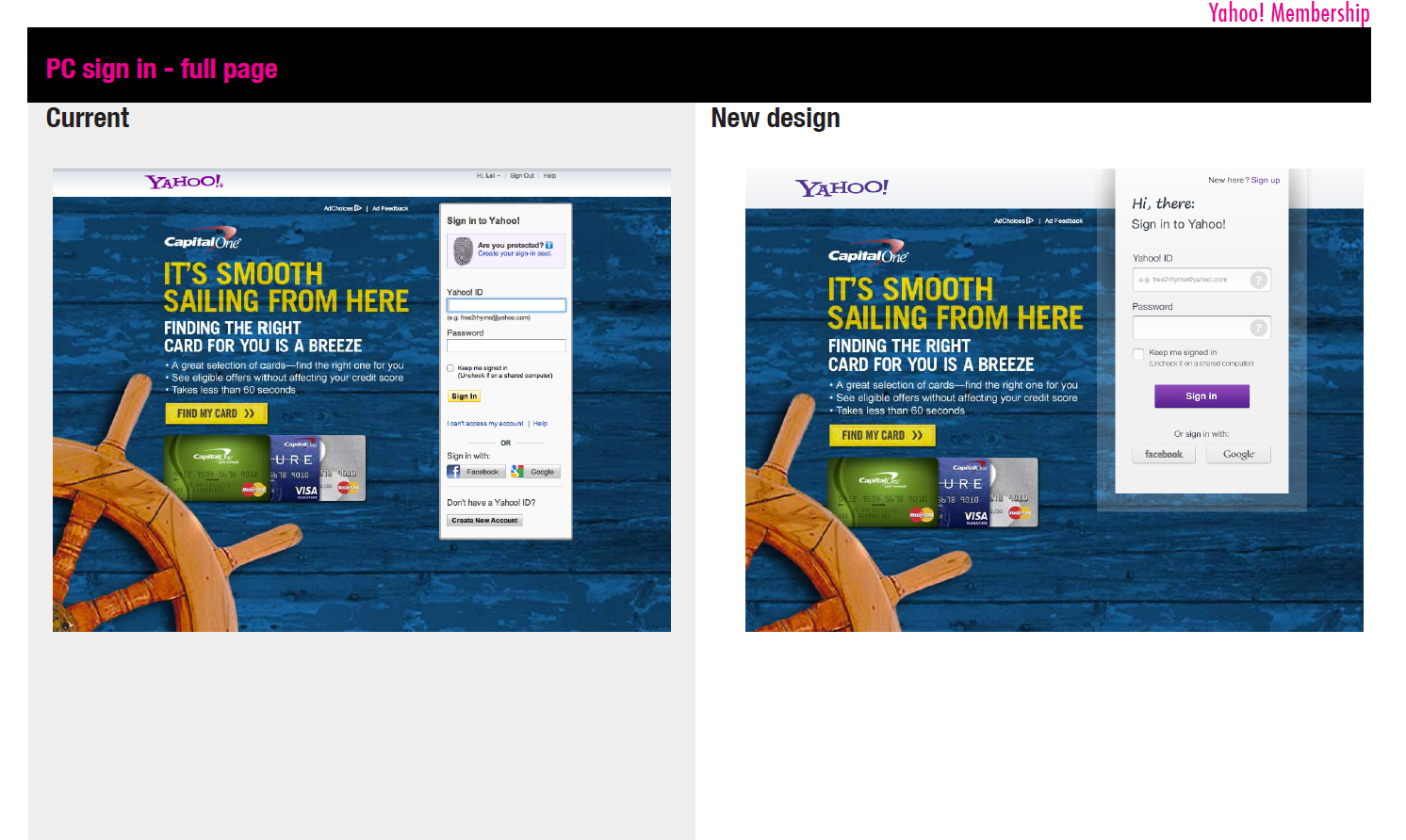
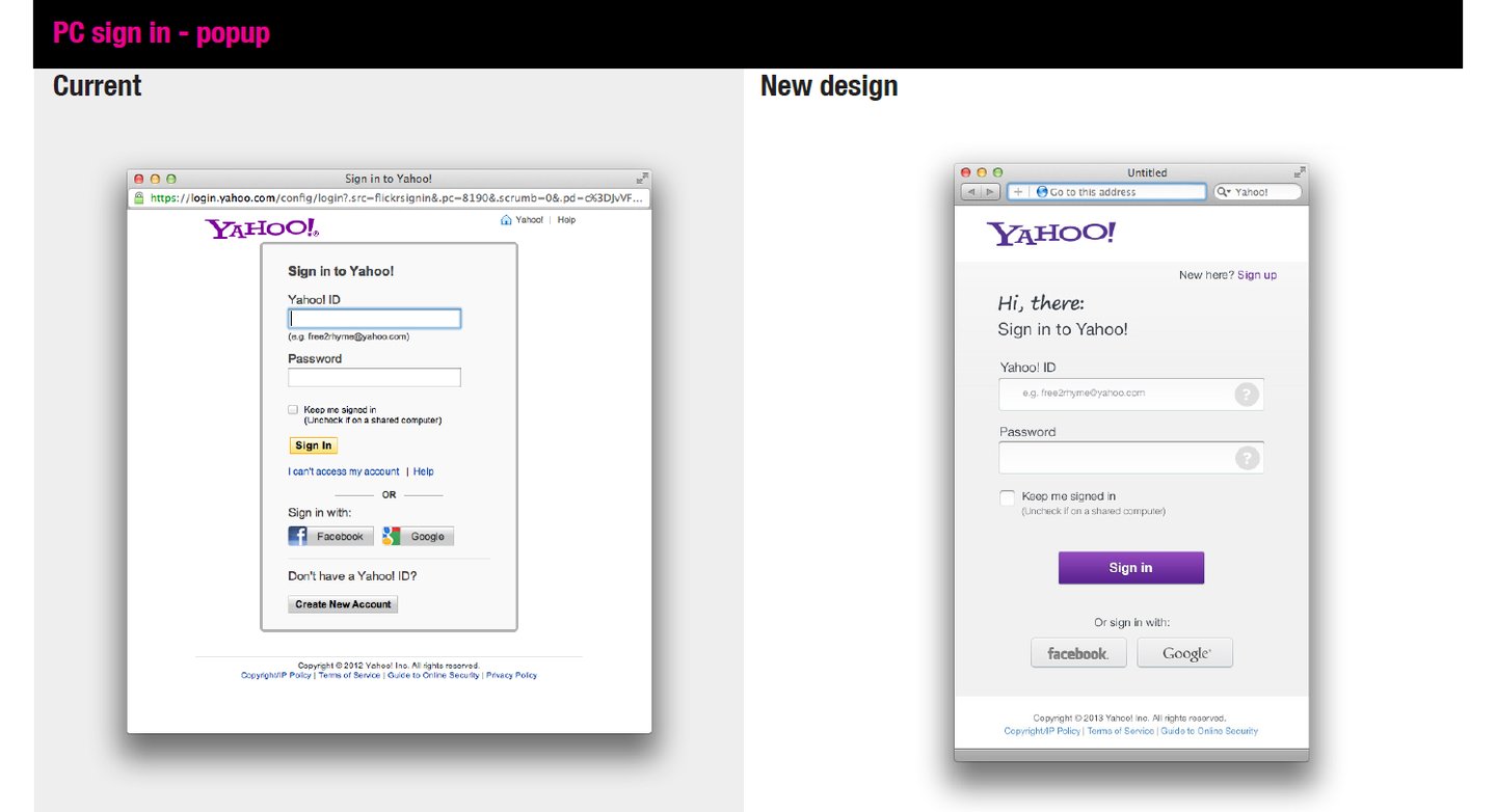
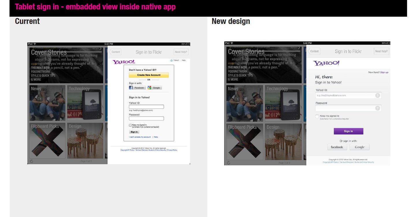
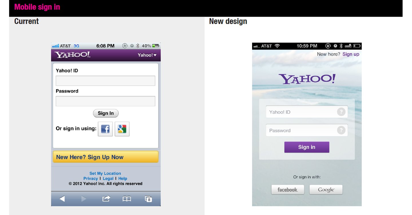
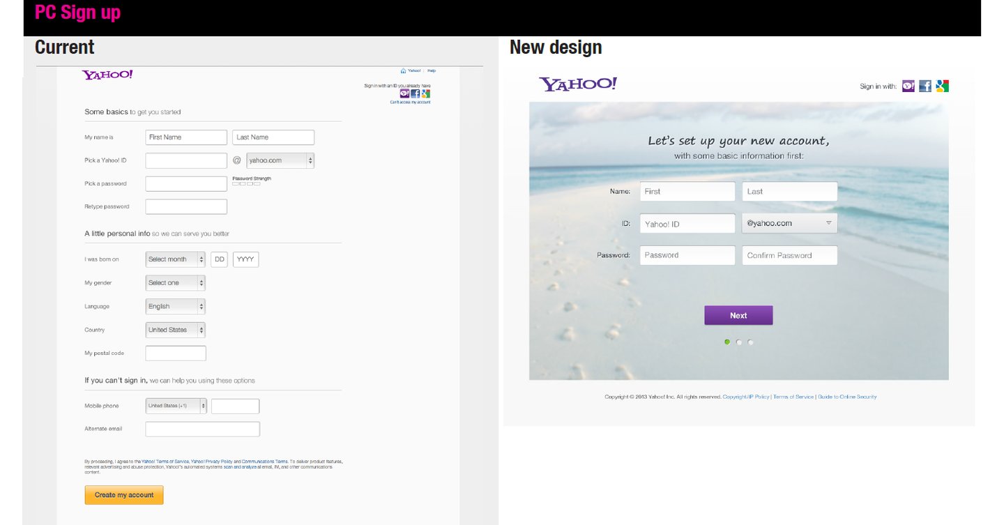
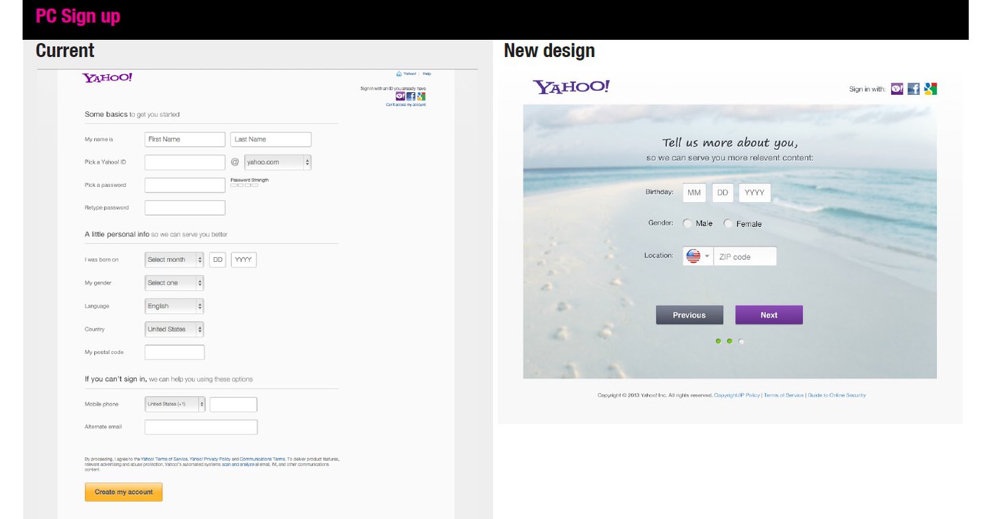
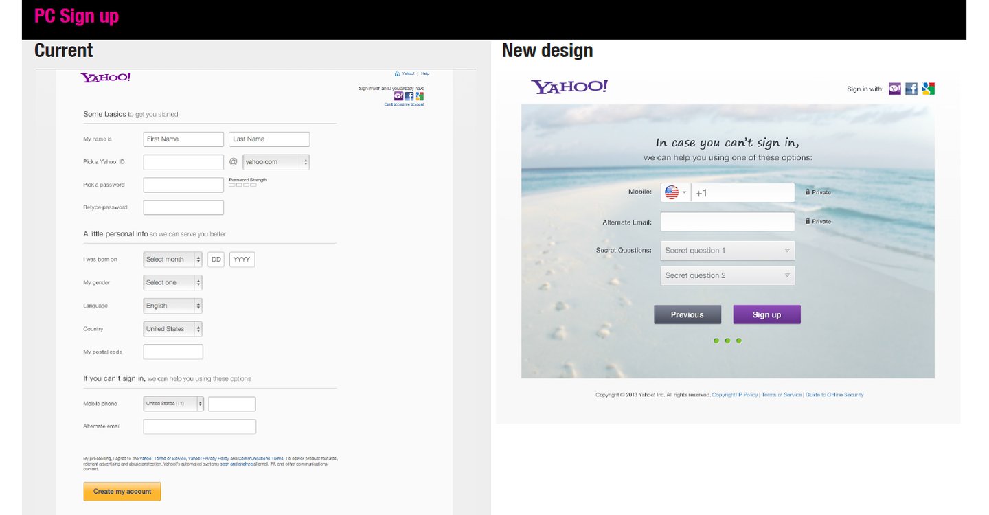
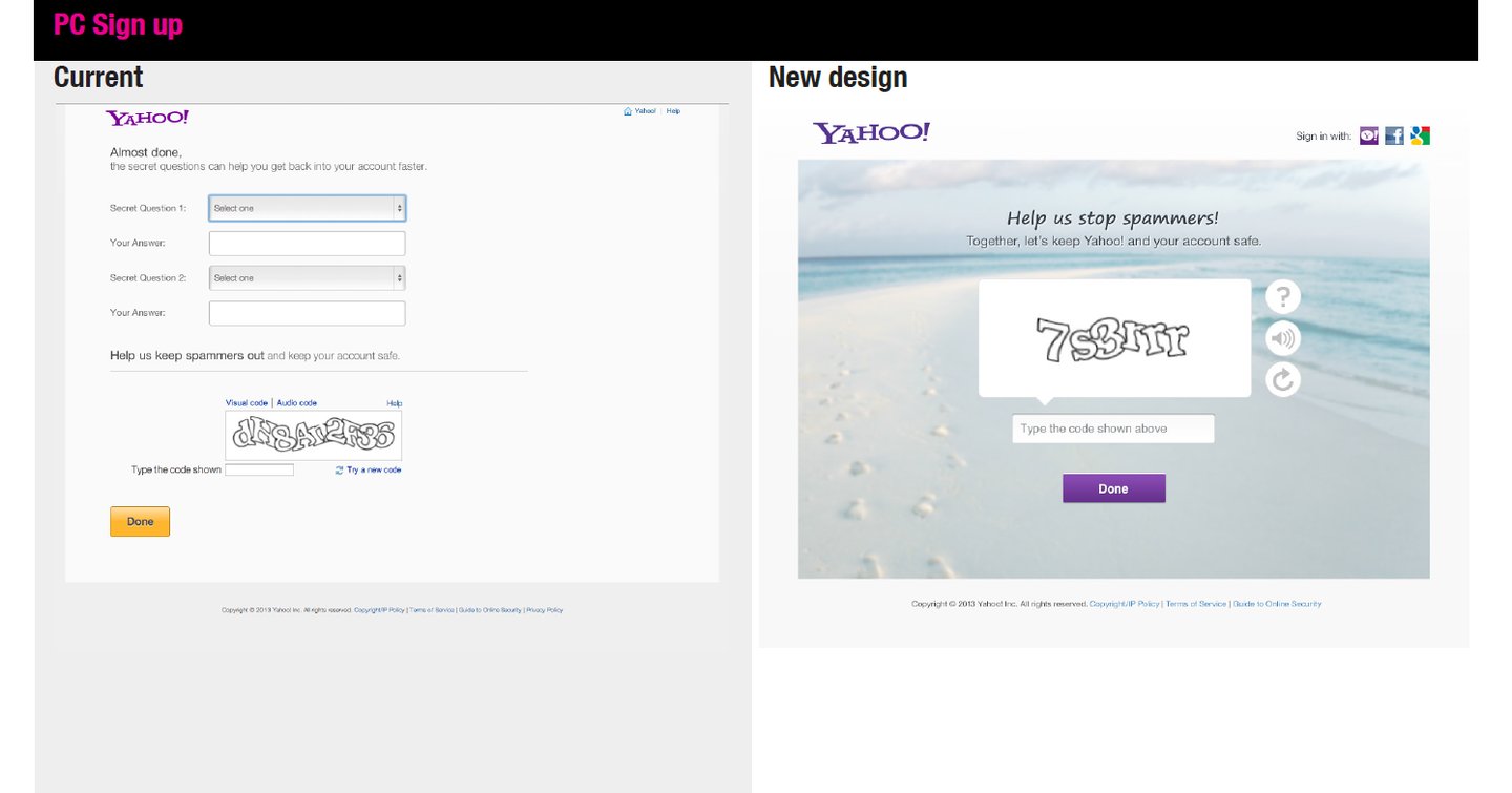
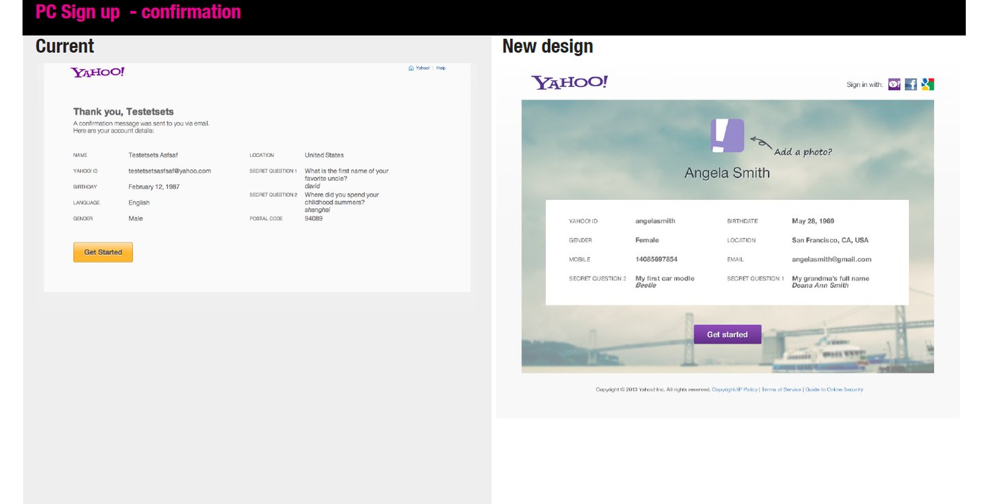
Here’s a clear UX comparison of the current (left) vs new design (right) and what’s improved:
Before: Dense, boxy layout with everything competing for attention.
After: Clean, minimal layout with strong hierarchy.
Friendly headline (“Hi, there”) draws attention first.
Primary action (Sign in button) is clearly dominant.
✅ Improvement: Easier to scan and understand within seconds.
1. Visual Hierarchy & First Impression
2. Simplification & Reduced Cognitive Load
Before: Multiple links and options clutter the form (Help, account recovery, OR divider, etc.).
After: Non-essential elements are minimized or de-emphasized.
✅ Improvement: Users focus only on what matters—logging in.
Before: Dense, boxy layout with everything competing for attention.
After: Clean, minimal layout with strong hierarchy.
Friendly headline (“Hi, there”) draws attention first.
Primary action (Sign in button) is clearly dominant.
✅ Improvement: Better usability and reduced input errors.
3. Form Field Design
4. Tone & Emotional Design
Before: Functional but impersonal.
After: Conversational and welcoming (“Hi, there”).
✅ Improvement: More human-centered, approachable experience.