Western Union Self-service Kiosk
Improving Transaction Speed & Reducing Friction in Retail Environments
Product Designer | UX Researcher | Visual Designer
6-month engagement
Collaborated with:
2 Project Managers
Content Strategist
Engineering teams (France, San Francisco, Denver)
Design System team
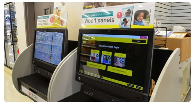
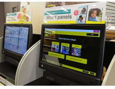
Western Union’s self-service kiosk was designed to provide convenience to retail customers while reducing operational costs.
At the time of the project:
~15,000 monthly transactions in the U.S.
~$5M in revenue generated at retail locations
Strong opportunity to scale self-service solutions
However, the existing kiosk experience showed minimal efficiency gains compared to retail agents.
My Role
OVERVIEW
The Challenge
Design a kiosk experience that:
Understand customer preferences & behaviors
Identify environmental and technical constraints
Optimize limited screen space
Reduce transaction time
Improve conversion rate
Discovery and Research
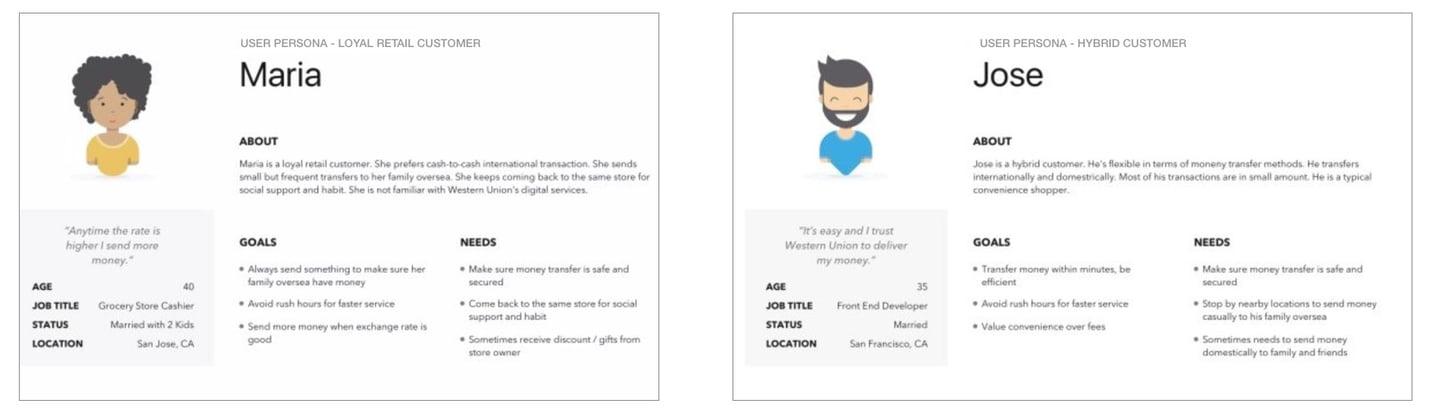
Persona
According to existing research data, there are three types of customers across the service ecosystem that the product will be targeting to 1) loyal retail customer, 2) hybrid customer, 3) new/potential customer.
User Interviews
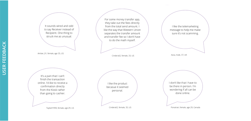
In order to understand the target audience a bit more, I conducted user interviews at Western Union's retail locations. By doing this, I could capture why customers use Western Union kiosk and what value they took from it.
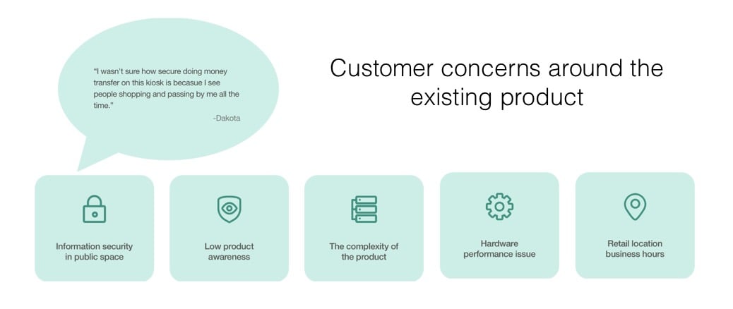
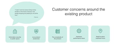
I learned that customers use our product to reduce the amount of time they have to wait in line. I also discovered concerns customers have with the current product
Key Insights
Information security in public space
Low product awareness
Complex user flow
Hardware performance issues
Limited retail business hours
Key Usability Findings

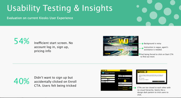
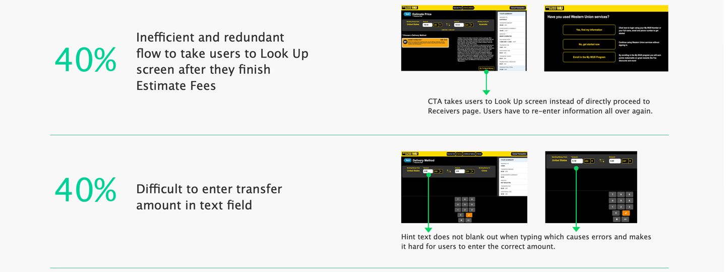
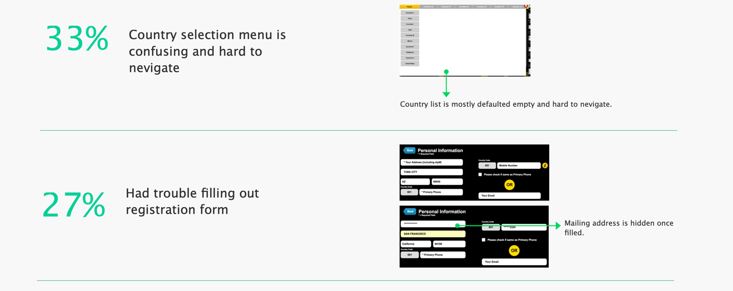
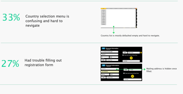
Simplify the start experience, streamline flow, clarify CTAs, and reduce cognitive load to increase completion rate.
High cognitive load
Poor visual hierarchy
Redundant steps
Lack of transparency
Trust concerns in public setting
Design Opportunity
Experience Gaps
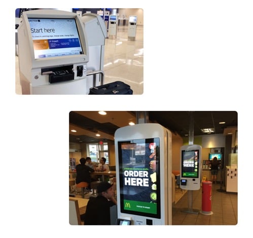
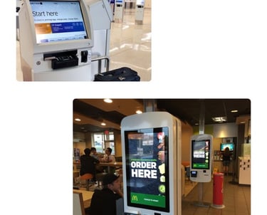
Competitor Research
I also looked at other similar products (such as airline kiosks, Coinstar, McDonald's) to further my research on what a useful kiosk product is comprised of. Some takeaways of what made them successful included:
- Well structured navigation
- Simplicity with no unnecessary steps and information
- Clear affordance
- Make text and elements visible with sufficient contrast
Design Goal
Minimize friction
Maximize transaction speed
Reduce cognitive load
Simplify content
Improve trust perception
In order to improve the user experience holistically, I created a user flow chart for kiosk experience.
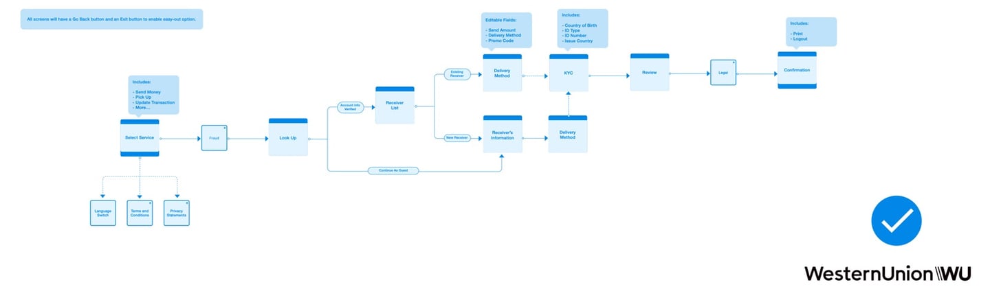
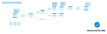
User Flow (Holistic Approach)
As for the ergonomics aspect, there are four important dimensions that have the direct impact on the interaction between user and kiosk machine.
They are the screen height, keyboard height, cash slot height (if applicable), and cash slot height (if applicable). Although the team has no control of Coinstar kiosk machine, the knowledge is good to know and keep in minds for.
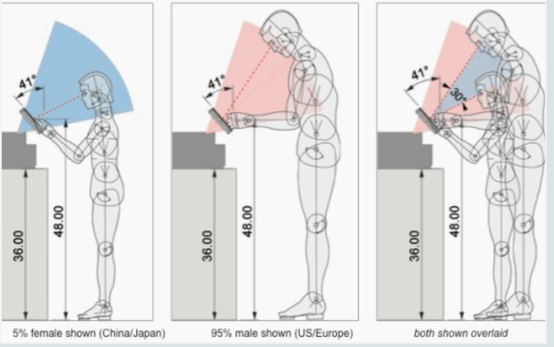
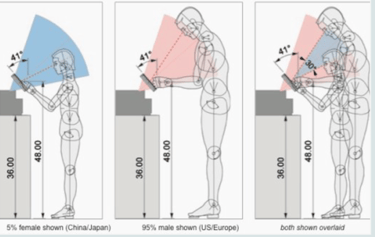
Environment & Ergonomics Evaluation
IDEATE and CREATe
I ran a brainstorming session that was composed of members from the design and product teams to determine which features of the existing product should stay, be relocated or be eliminated based on the metrics we have for the existing product.
The conclusion is that the new kiosk product will be focusing on the send money flow which is the core of the business and gets the most traffic.
And it must include the following key features in order to provide a complete and comprehensive user experience:
Select Service | Lookup Screen | Recipient's Information | Price Estimate | Review & Confirm | Payment and Print
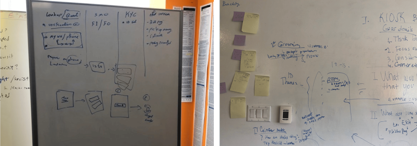
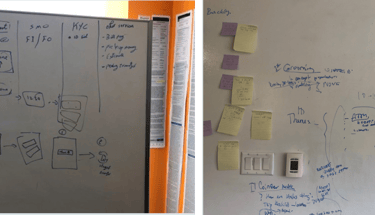
Brainstorming & Sketches
Based on the research findings and team brainstorming results, wireframes are created for stakeholders to review to gather further feedback which gives flexibility for the team to iterate on the design at the early stage and avoid any wastes during the development process. The interactive prototype is also created using the wireframes to test the flow at the early stage to validate the experience design.
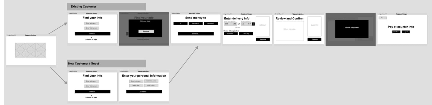
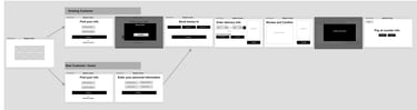
Low-fi Mockups
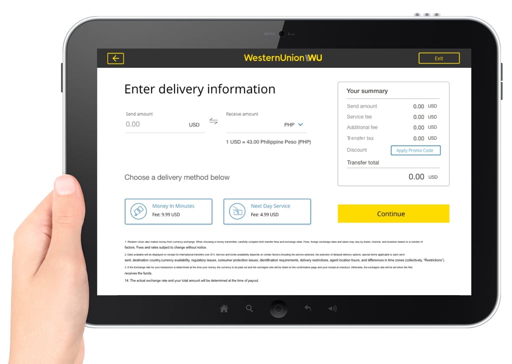
Since the style of the kiosk machine has already been established in the Design System, the team moved forward with hi-fi mockups once the screen wireframes got approved by product and legal team.
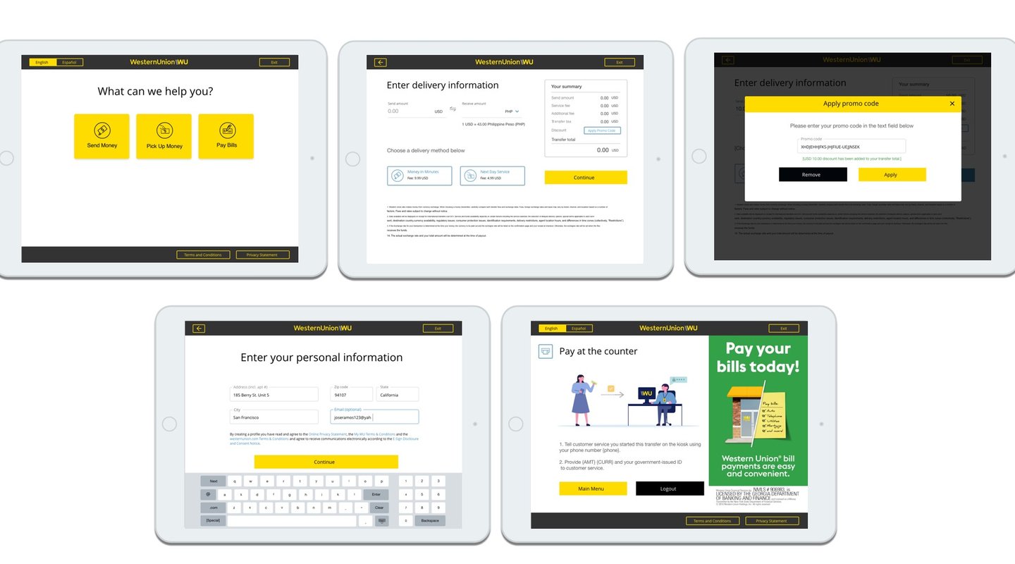
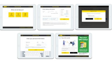
High-fidelity screen mockups
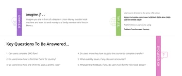
TESTING and VALIDATION
Usability testing is involved in every key stage of the development process to help the team looking for design flaws and pain points to reduce user friction and improve the experience of the product. The primary tool we use is field research and interview, as well as online testing which allows us to get direct feedback from users in a timely manner.

Testings and Validation
Impact
The product launch plan consists of two phases.
Phase 1 is to launch the pilot to 10% of the vendor locations to test the market.
Phase 2 is to launch the product nationwide in France.
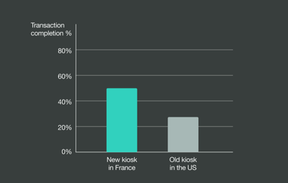
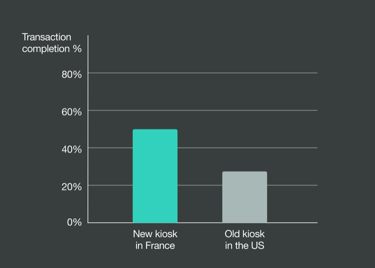
When comparing the early-stage conversion metrics between the US kiosk product and the newly-designed French version, we noticed a 23% difference in the transaction completion rate.
Additionally, among the users who completed the transaction steps and reached the review page, the drop-off rate has decreased from 35% to 14%.
Challenges and learnings
One of our main challenges is the lack of resources and time that we have. With this challenge, we often have to reiterate our designs in order to be achievable within time and technical constraints, while still providing more value to our users.
On the other hand, the hardware machine that the product will be running on was not available for us. That caused the team had to run QA testings on a simulator rather than on the real device. We encountered bugs that cannot be captured in the simulator. That caused the delay in the production.