Munch
Mobile App - Virtual Shopping at Intensive Care Unit Environment
Overview
Munch is a conceptual UX solution designed to support families and caregivers in ICU waiting environments by enabling easy access to food and essentials without leaving the hospital.
It addresses the emotional and logistical challenges faced by caregivers who must remain close to critically ill patients while managing basic needs like meals and groceries
Discovery and Research
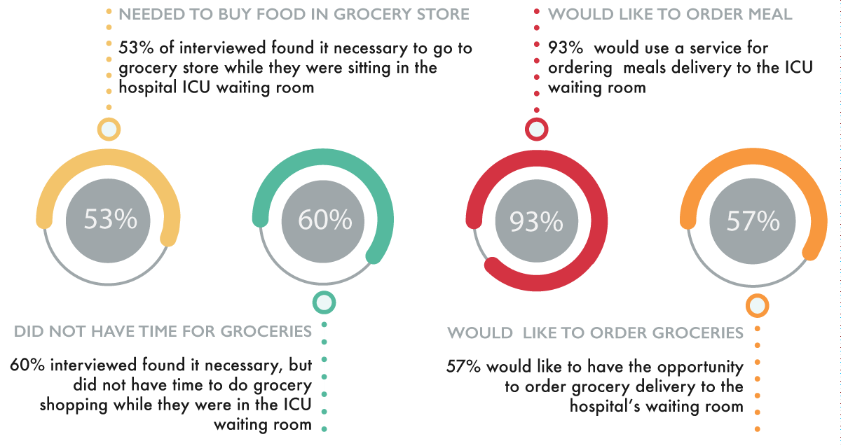
Limited access to food inside hospital ICU environments
Caregivers cannot leave patients unattended for long periods
Late-night food delivery options are unreliable
Need for quick access to essentials, especially for families with children
Problem Statement
Design Concept
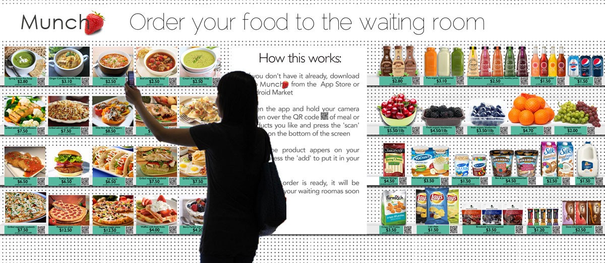
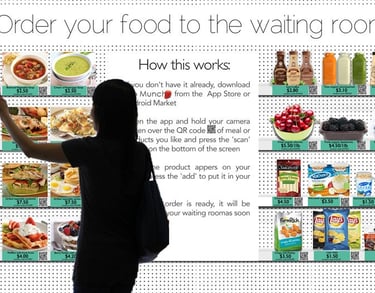
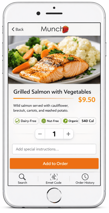
A virtual grocery experience embedded in ICU waiting rooms using a physical poster with QR codes linked to a mobile app.
Users scan items, place orders, and receive delivery directly in the waiting room via hospital cafeteria staff.
Obervation
Interviews with ICU doctor and Health Informatics faculty
15 survey participants with ICU waiting experience
Users experience emotional stress when leaving ICU areas
Need for fast, simple, low-cognitive-load ordering systems
Storyboarding
Based on user scenarios and workflow analysis, I created a storyboard illustrating:
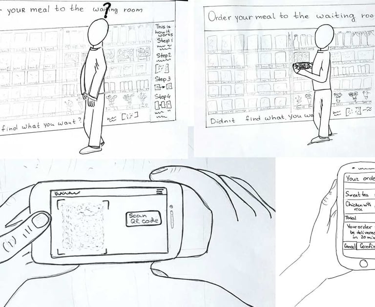
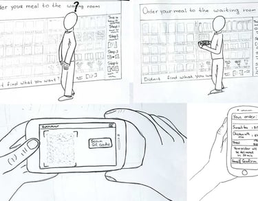
User notices the ICU waiting room poster
User scans QR code of desired meal or grocery item
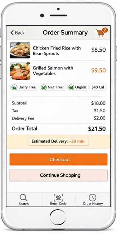
User browses and places order through the app
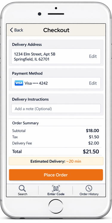
User confirms delivery details and payment
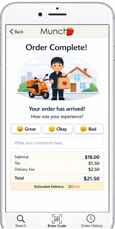
Hospital cafeteria prepares and delivers the order to the waiting room
This helped visualize the emotional and functional journey in a high-stress context.
Conceptual model
Field study, observation, data gathering, flow model, users scenarios and storyboarding helped me to design a conceptual model.
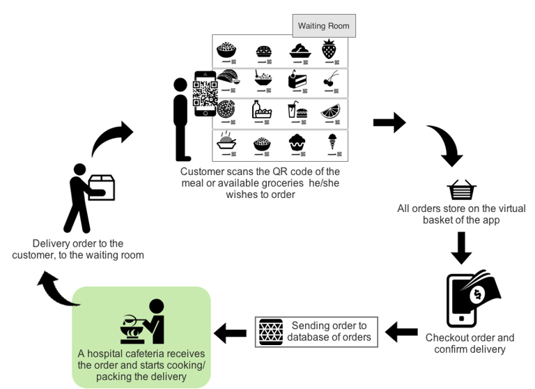
The user downloads and installs the app on his/her mobile device by following instruction from a designed poster.
The user scans the QR codes of the meal or available groceries he/she wishes to order.
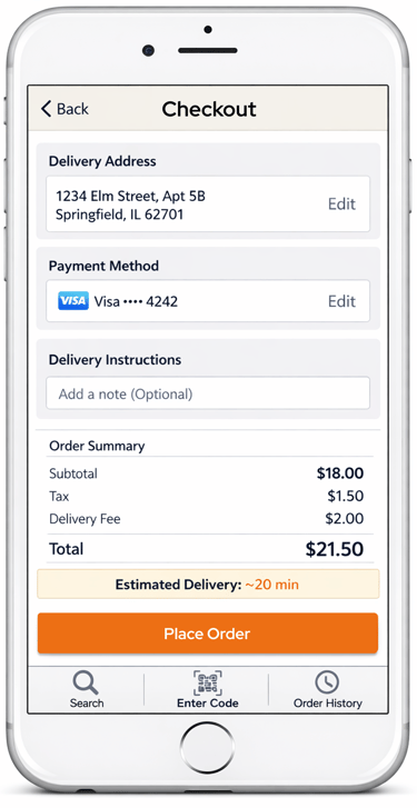
User checkouts the order, confirms delivery details and pays for the order by using his/her debit/credit card or Pay-Pal account.
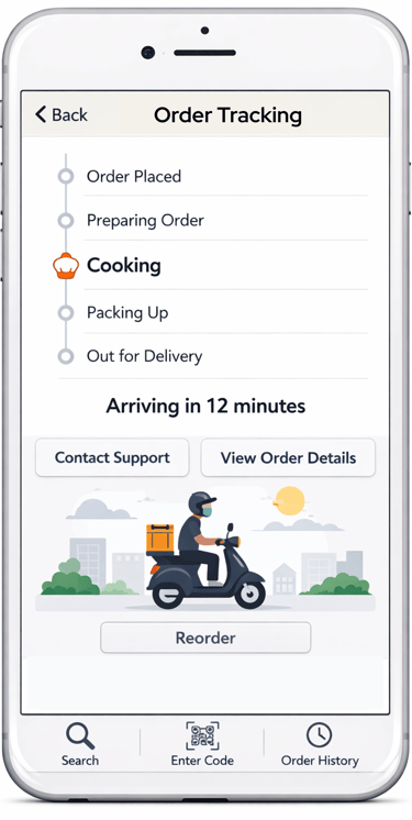
The hospital’s cafeteria will be responsible for receiving orders, meal preparation, packing and delivering the orders to the customers in the waiting room.
The responsible cafeteria worker will brings the order to the customer, to the waiting room.
PROS: Expenses and time for the order delivery will be minimal.
CONS: Not all individuals are completely satisfied with food prepared in the hospital cafeterias
IDEATE and CREATe
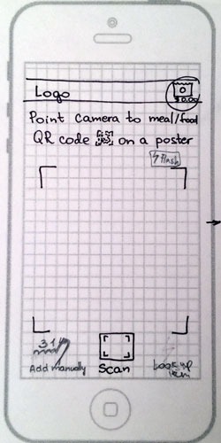
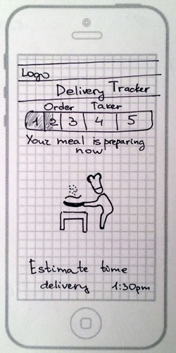
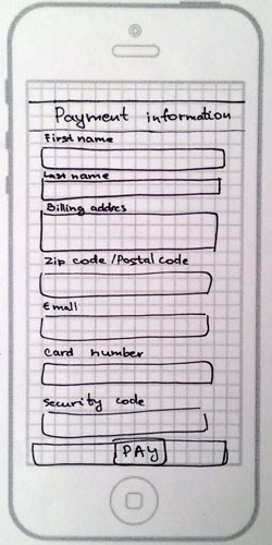
Low-Fidelity Wireframe
Initial sketches focused on:
Simplified QR-based ordering flow
Minimal navigation steps
Clear categorization of food items


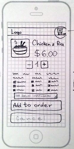
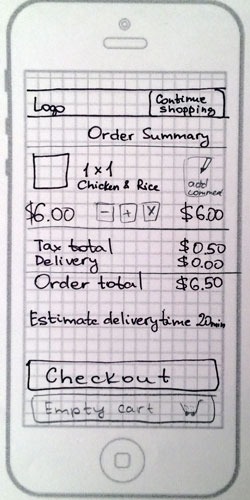

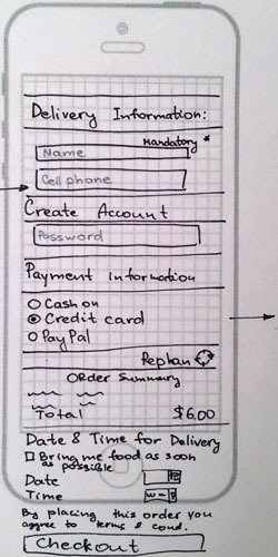


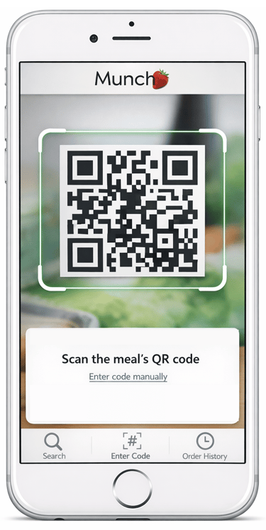
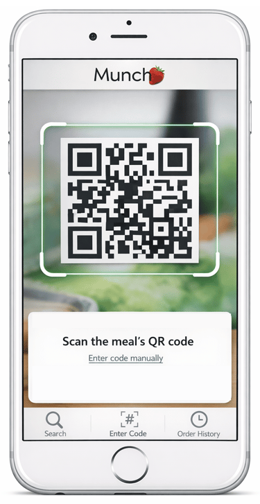
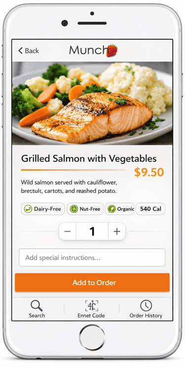
High-Fidelity Wireframe
Focusing on:
Clean UI for high-stress environments
Large touch targets and readable typography
Simple checkout flow

USER TESTING
7 participants (ages 20–60+)
Task-based usability testing
Think-aloud protocol
Pre- and post-task questionnaires
Metrics: SUS, task success rate, time-on-task
Methodology:
Key Findings:
Users preferred clearer instructions for each step
Search functionality needed enhancement (support for product names, not just codes)
Overall experience was intuitive and well-received
6 out of 7 participants said they would use the system in real ICU environment
Usability Insights
Clarity is critical: Users need explicit guidance in high-stress environments
Search flexibility matters: Users expect natural language product search
Trust is essential: Hospital-based systems must feel reliable and simple
Emotional context influences UX: Reducing cognitive load improves adoption
Outcome
The final design demonstrated that a location-based, QR-enabled virtual grocery system can meaningfully reduce stress for caregivers in ICU waiting rooms.
The project validated that even small UX improvements in healthcare environments can significantly improve emotional and functional user experience.