Mobile App Secure Login Experience
Role
Product Designer, User Researcher
Duration
4 months
Goal
Enhance the mobile app’s secure login experience by streamlining the login and password recovery process
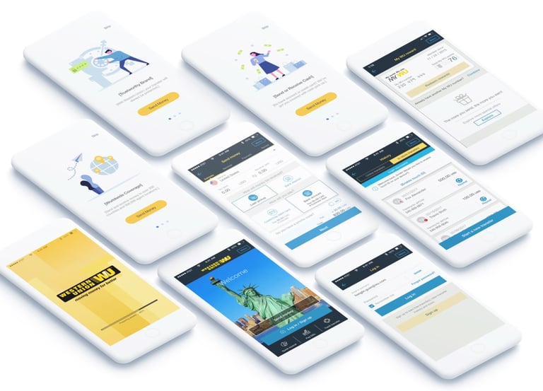
Western Union has been constantly working on improving customer experience and attracting new customer segments in its core app. As a continuation of these efforts, the product management proposed to re-think the mobile app login experience to minimize friction.
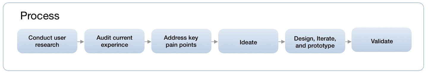
Discovery and Research
While I was revisiting the existing experience, I started breaking down the information architecture into fundamental pieces. From there, I managed to filter out the unnecessary steps and redundant information that won't benefit the goal of creating a fast and easy money transfer user experience.
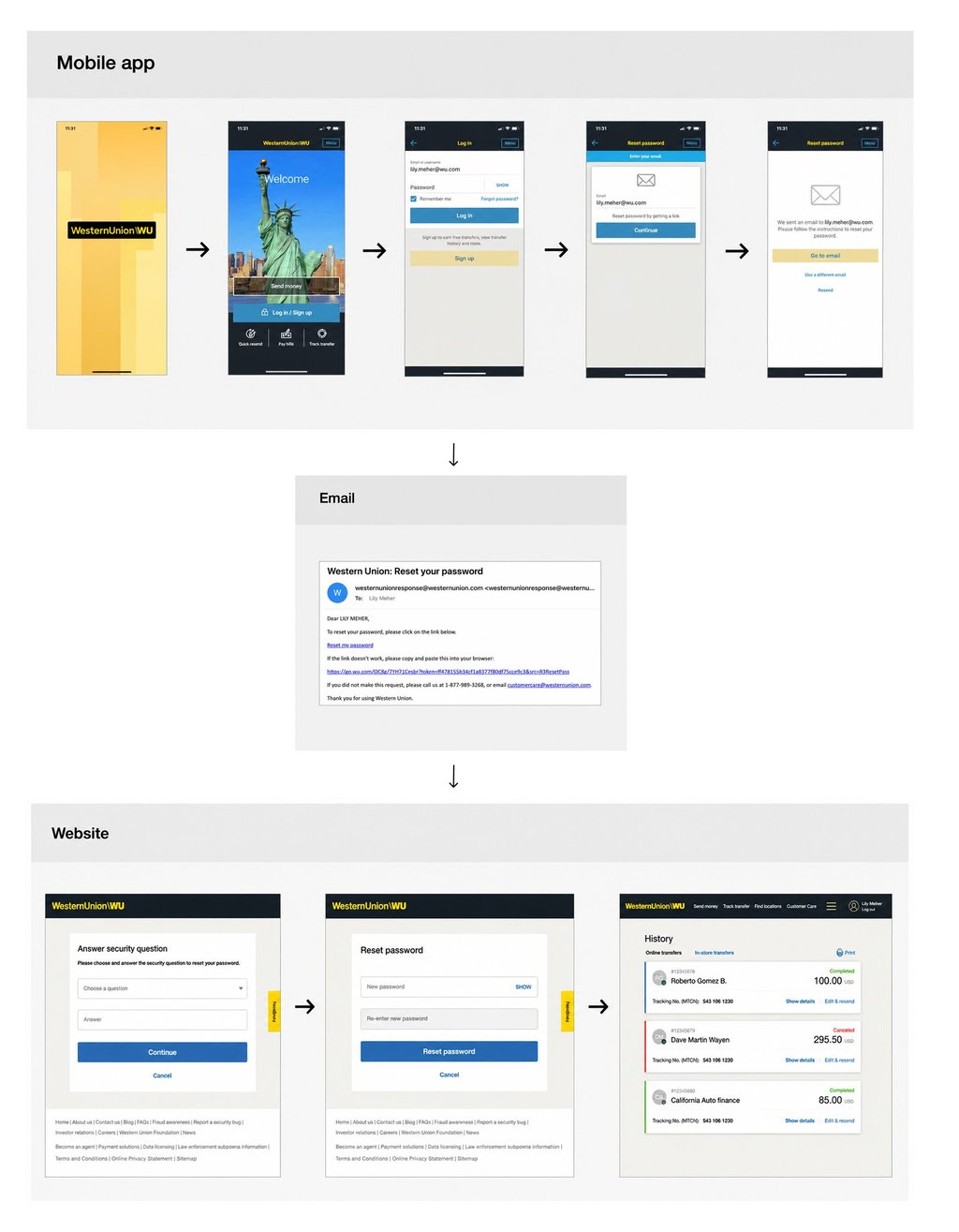
For instance, I noticed the reset password experience on our mobile app is cumbersome because it requires users to go through many steps across multiple platforms (app, email, web). Below is the old flow that I evaluated:

Problems & Pain Points
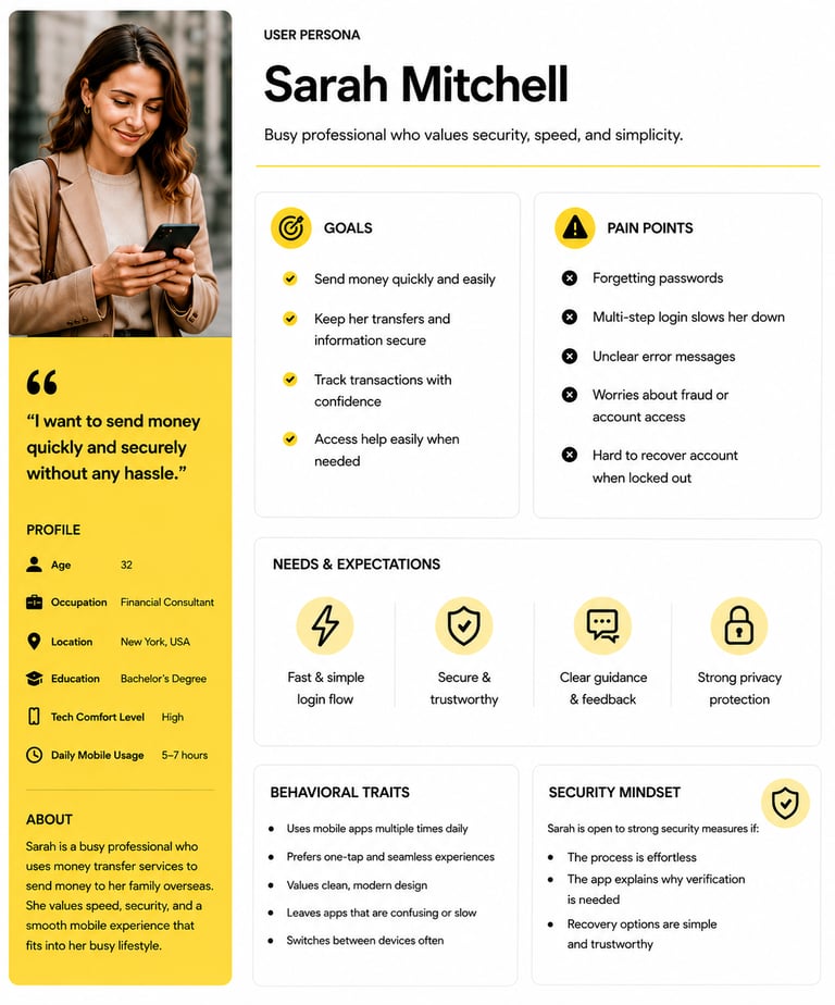
Persona
Based on discovery research, this persona was created to better understand the target user, their needs, behaviors, goals, and pain points throughout the experience.
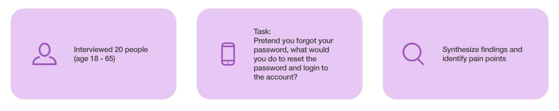
To make sure we are solving the real problem for the right audience, I often have to get contacted with the users and gather insights from them directly through user interviews and testing.
Taking the reset password experience as an example again. By doing user testing and interviews, I learned that our existing mobile app users prefer:
Reset password experience happens on one single platform.
Use commonly-used social media account to log in.
Verify identity and device via an SMS/one-time password.
Remove security questions because the answers are often forgotten by users
User Testing With Old Experience
Design goals often times are defined by the collaboration between project managers and designers after analyzing the problem(s) and synthesizing the research findings.
Taking customers' feedback into consideration, we decided to
Add Phone Number as a login ID option to provide easy access to mobile users.
Remove security questions to further simplify the password recovery experience
Send a one-time passcode to user's phone to keep verification on one platform and speed up the process.
Design Goals and Objectives
Once the flow was finalized, I researched password recovery experience in other popular mobile apps such as PayPal, Uber, and Instagram. The general flow of the password reset process that I looked at all provides an OTP (one-time-password) for users to quickly verify themselves.
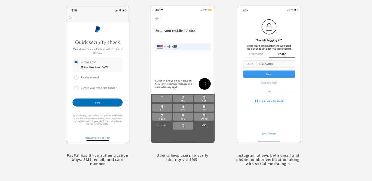
Competitive analysis and references
IDEATE AND CREATE

Roadblocks and Challenges
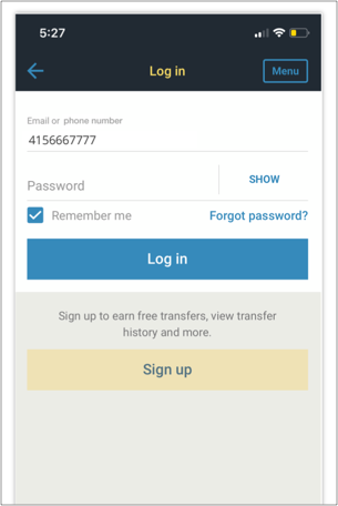
The original solution is to simply add phone number text to the login ID input field label to let users know they can use the phone number as a login ID.
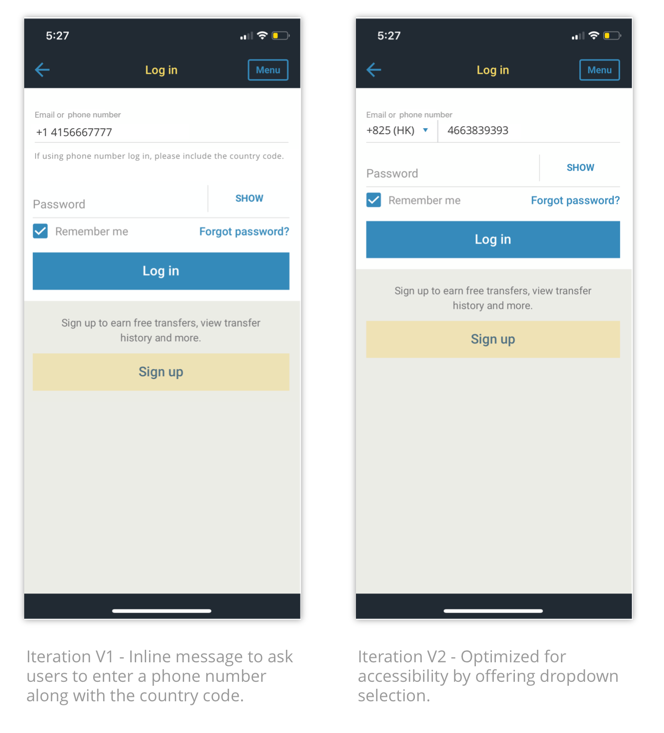
But there are 12% of customers registered using a non-US phone number and our backend code is not able to figure out the country of origin for the international phone users unless they enter the full version of the phone number including the country code.
To accommodate the technical constraints, including country code in the input field became a mandatory requirement to ensure the 12% of the international customers can log in and receive the message.
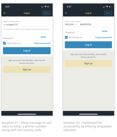
Iterations
The first iteration is to add an in-line message to ask users to enter country code along with the phone number.
However, user testing results showed 80% of the users were not sure about the country code of their phone number.
Taking user testing feedback into consideration, in my second iteration, I added a dropdown menu to serve as a shortcut for accessibility purposes.
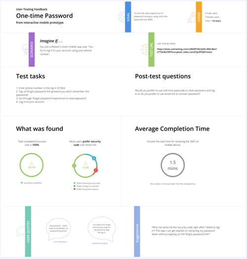
Testing and Validation
To ensure the design solution works well among customers, we oftentimes use interactive prototypes to test the new design against the old experience or the previous version to gather users' feedback. It enabled us to identify the usability issues and priorities of what remains left needs to be fixed and it also helped us to validate our assumption we set at the beginning of the project.
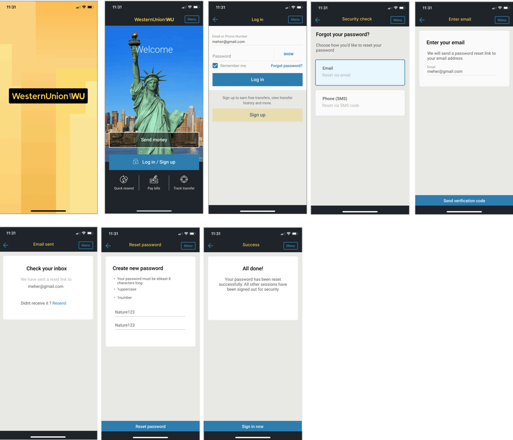
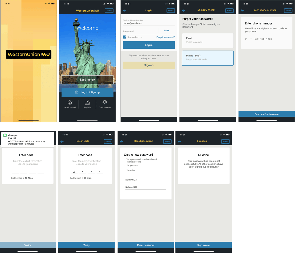
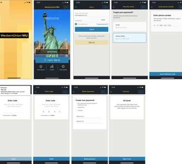
After validating the design through user testing, we finalized a streamlined password recovery experience. When users select the “Forgot password” option, they are guided to choose their preferred recovery method—either by entering their email address to receive a reset link or by using their phone number to receive a verification code.
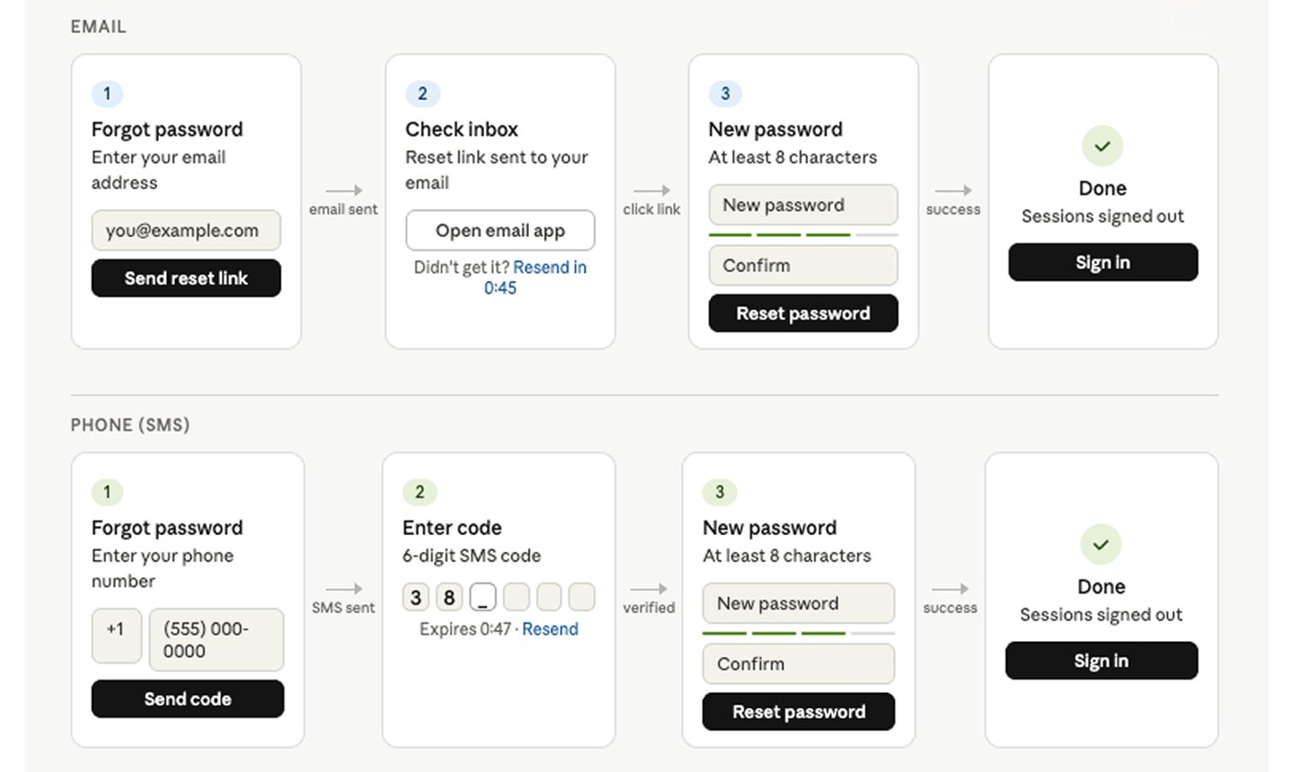
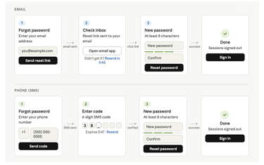
The New Password Recovery Experience
High-fidelity screens were assembled using the existing screens and templates from the component library.
Visual treatment (high fidelity wireframes)
Email - Password Recovery Flow
Phone - Password Recovery Flow
LEARNING AND takeaways
"Magic happens when teamwork happens"
I’m lucky enough to have the opportunity of working on a product that impacts how people spend money on such a large scale. When looking back, here are a few things I would like to keep in mind moving forward.
"Respect Existing Patterns"
In the process of establishing the UI paradigms, which was built before has its reasons to be the way it is. Understanding the reasoning behind the old patterns is as important as designing the new rules.
"Iteration Within Scope "
One of our main challenges is the lack of resources. With this challenge, we often have to reiterate our designs in order to be achievable within time and technical constraints, while still providing more value to our users.
"Keep Asking Why, Why Not, What If " As a designer, we often want to think out of the box to show our creativity. However, in some cases, we need to find a balance between think out of the box and play safe. One way to do it is to constantly question ourselves until knowing what really matters the most before making a design decision.