Modernizing the Payoff Order Workflow
MY ROLE
Role: Lead UX Designer
Product: Payoff Order Management Platform
OVERVIEW
The Payoff Order process is use by mortgage processors to request, track, review, and complete lender payoff requests.
CASE STUDY
A detail examination
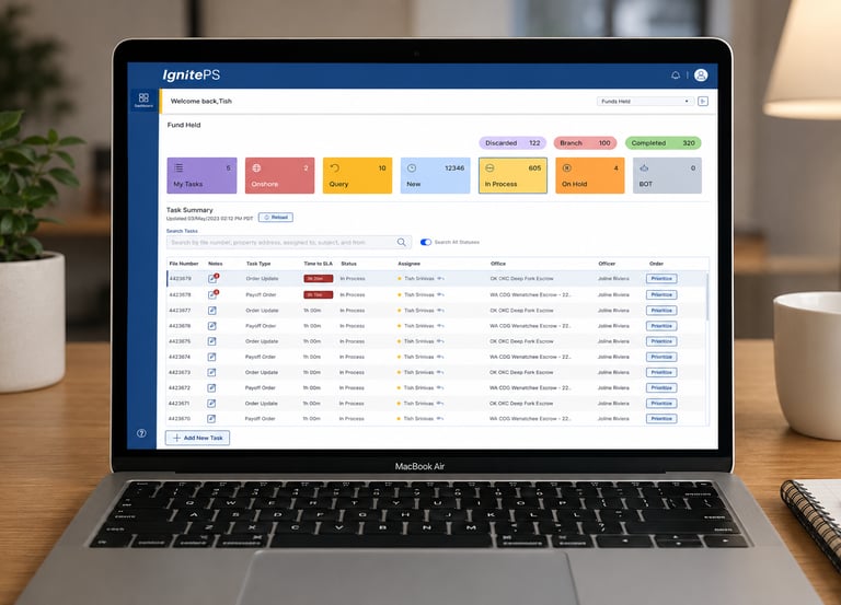
GOAL
Processors managed payoff requests using multiple disconnected applications and documents. Every request required constant switching between screens, manually copying data, tracking status outside the system, and verifying information repeatedly.
Context
The existing Payoff Order workflow was built on a decades-old desktop application used by processors to request, track, review, and complete mortgage payoff orders. Completing a single request required users to navigate dozens of screens, manually transfer information between applications, and rely on external tools such as Notepad and email.
Challenge
The objective was to simplify the workflow, reduce manual effort, eliminate errors, and create a more efficient end-to-end user experience.
1.Research
The existing payoff order process required processors to navigate multiple disconnected screens, copy information between systems, create worksheets, verify documents, manually update tracking records, and send emails throughout the request lifecycle. Completing a single payoff request often involved 20–40 navigation steps, frequent context switching, and significant manual effort, increasing processing time and the likelihood of errors.
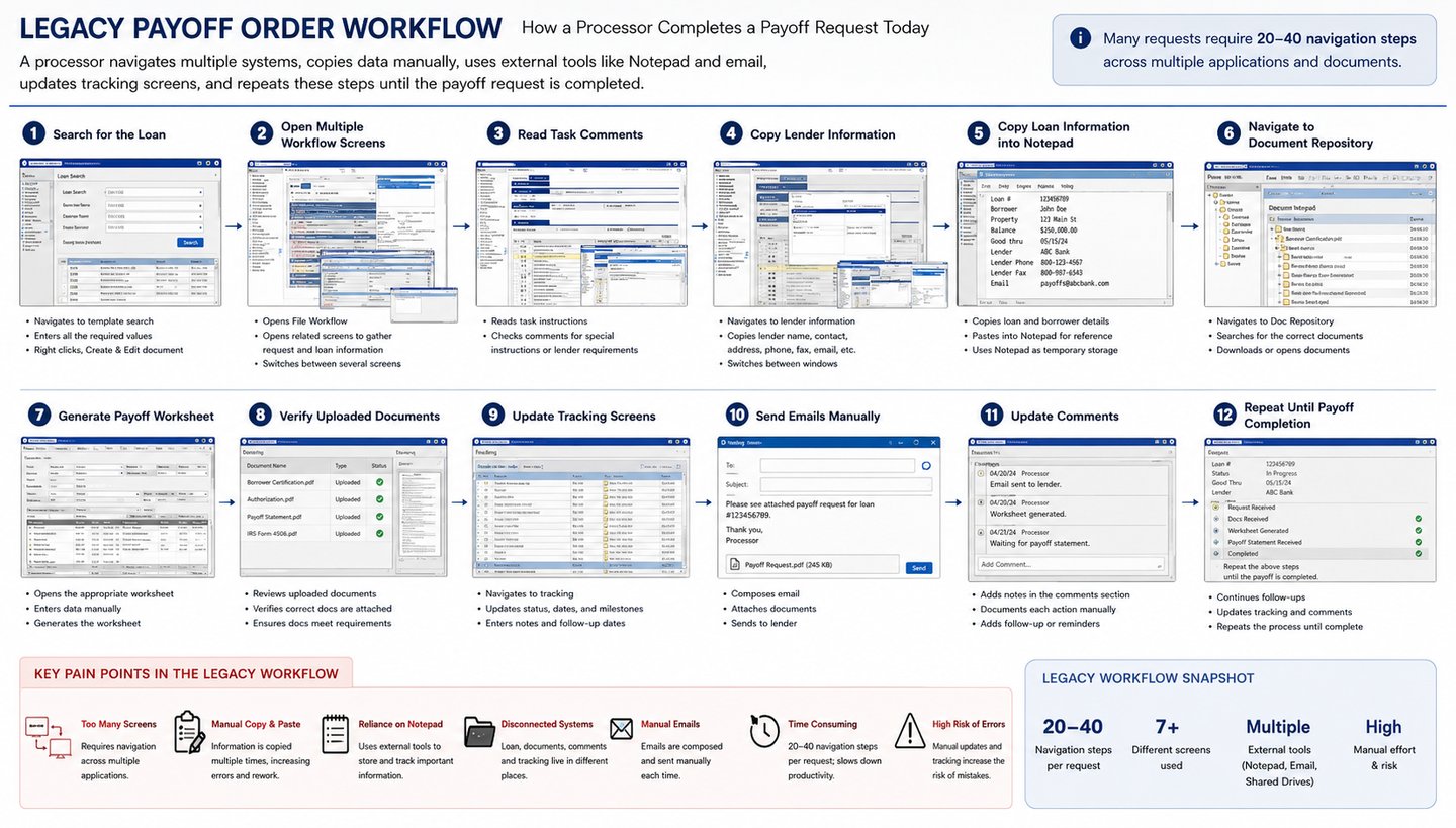
UNDERSTAND THE Legacy Workflow
Conducted user interviews with Mortgage processors to understand their workflows, pain points, and needs.
Interviewed 4 participants through UserTesting.com to gather qualitative insights and identify usability issues.
Conducted stakeholder interviews.
Shadowed processors performing real tasks.
Documented current-state workflows.
Identified bottlenecks and manual workarounds.
Created journey maps and task flows.
Prioritized usability issues based on business impact.
Used Microsoft Copilot to analyze interview transcripts, summarize key findings, and generate research recommendations.
STakeholder INTERVIEWS
"Notepad is basically part of our workflow because there's nowhere in the system to keep temporary information."
- Processor
"Finding the information I need feels like a scavenger hunt. Every piece of data lives in a different place."
- Processor
WHAT WE HEARD FROM USERS
"It's hard to know the true status of a request without opening multiple screens and reading through comments."
- Processor
"I spend more time switching between screens than actually processing the payoff request."
- Manager
"The amount of copying and pasting we do every day is overwhelming. It's easy to miss a field or make a mistake."
- Processor
"I constantly double-check my work because one wrong value can delay an entire payoff request."
- Processor
"If everything I needed was on one screen, I could finish requests much faster."
- Processor
"Comments are scattered everywhere, so I waste time trying to figure out which note is the latest."
- Processor
"The process hasn't changed in years—we've just learned to work around its limitations."
- Processor
Information architecture was fragmented.
Navigation required excessive clicks.
Duplicate data entry across multiple screens.
No workflow guidance.
Inconsistent terminology.
Heavy dependence on memory.
Poor discoverability of actions.
High cognitive load.
Minimal automation.
Outdated desktop UI patterns.
Research insights (UX PROBLEM IDENTIFIED)
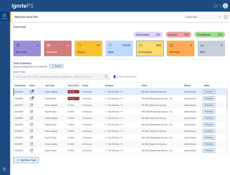
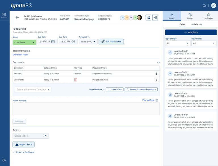
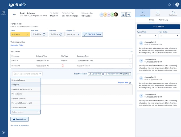
Define a more effective method for the Processor to quickly process files, be able to track and reassign at-risk orders, and manage and complete existing orders more efficiently and easily.
PROPOSED SOLUTION BASED OF USER RESEARCH
To ensure the solution addressed real user needs, I created a primary persona based on qualitative user research.
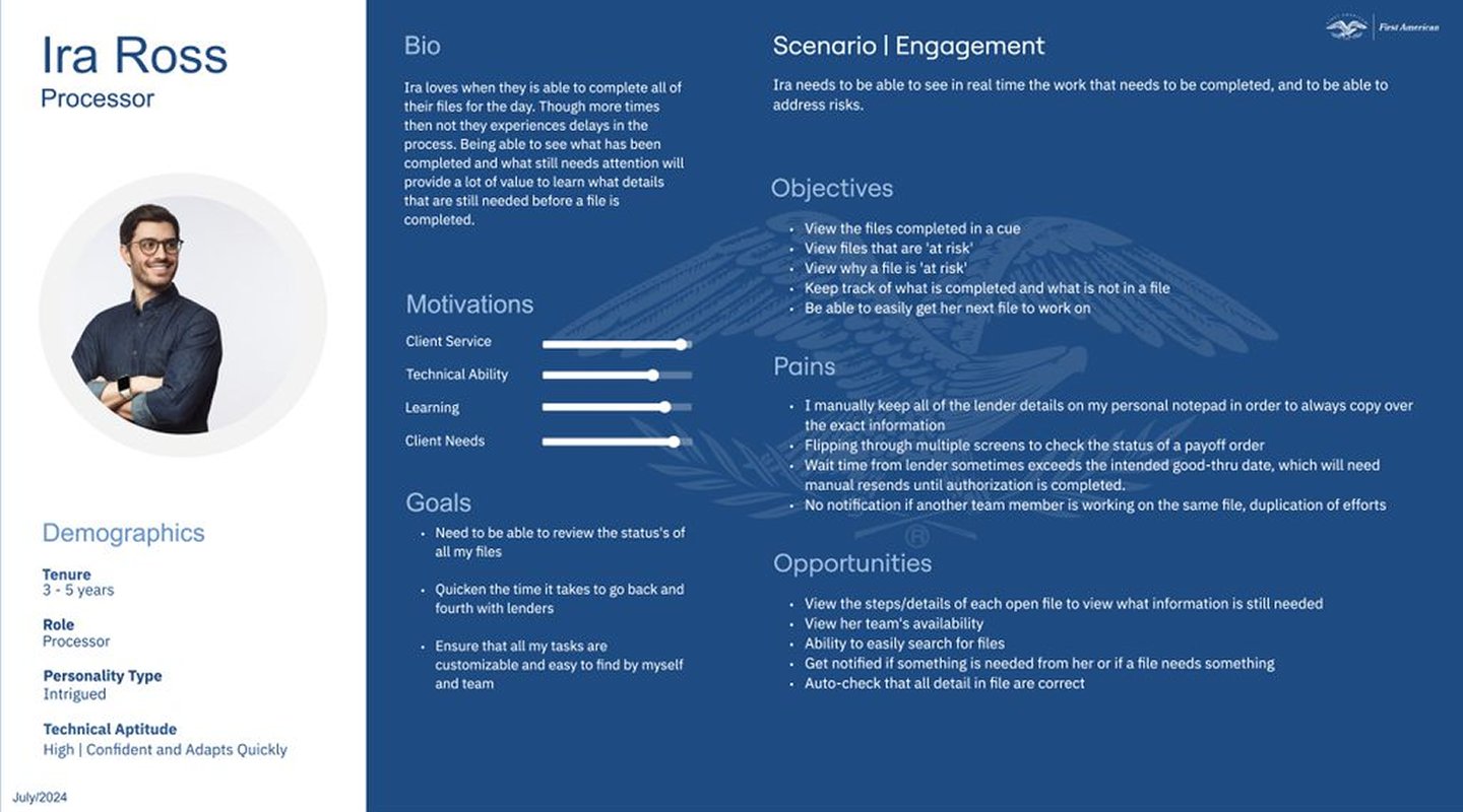
Persona Creation
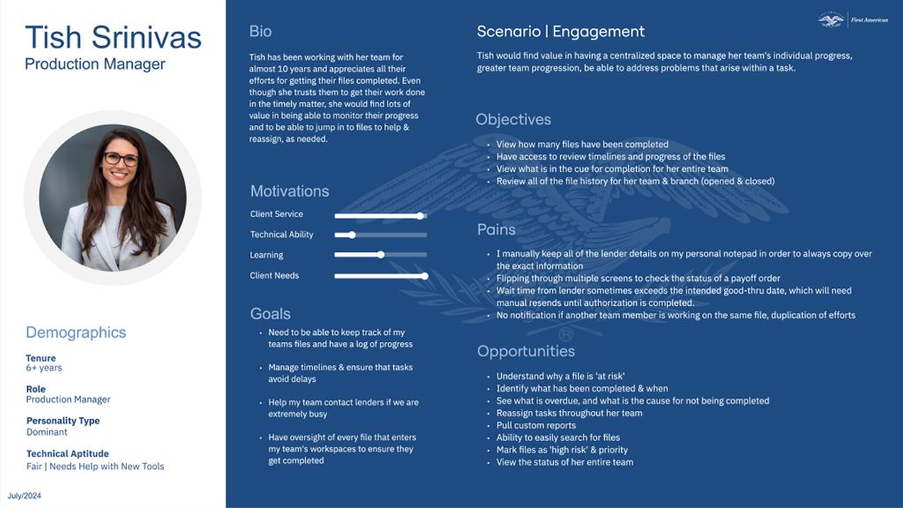
2.Ideate
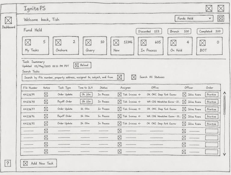
This step helped define the key features and functionality the Mortgage Processor application needed to support the selected user workflow.
Low-Fidelity WIREFRAME
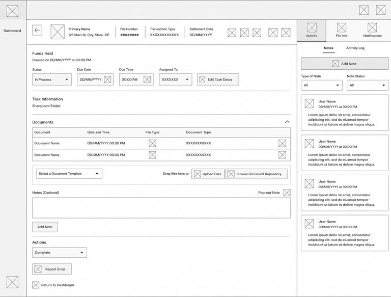
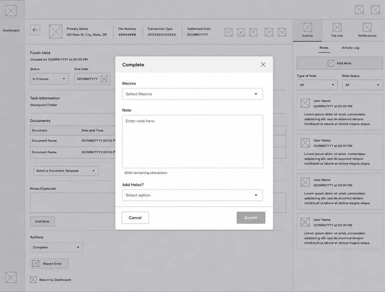
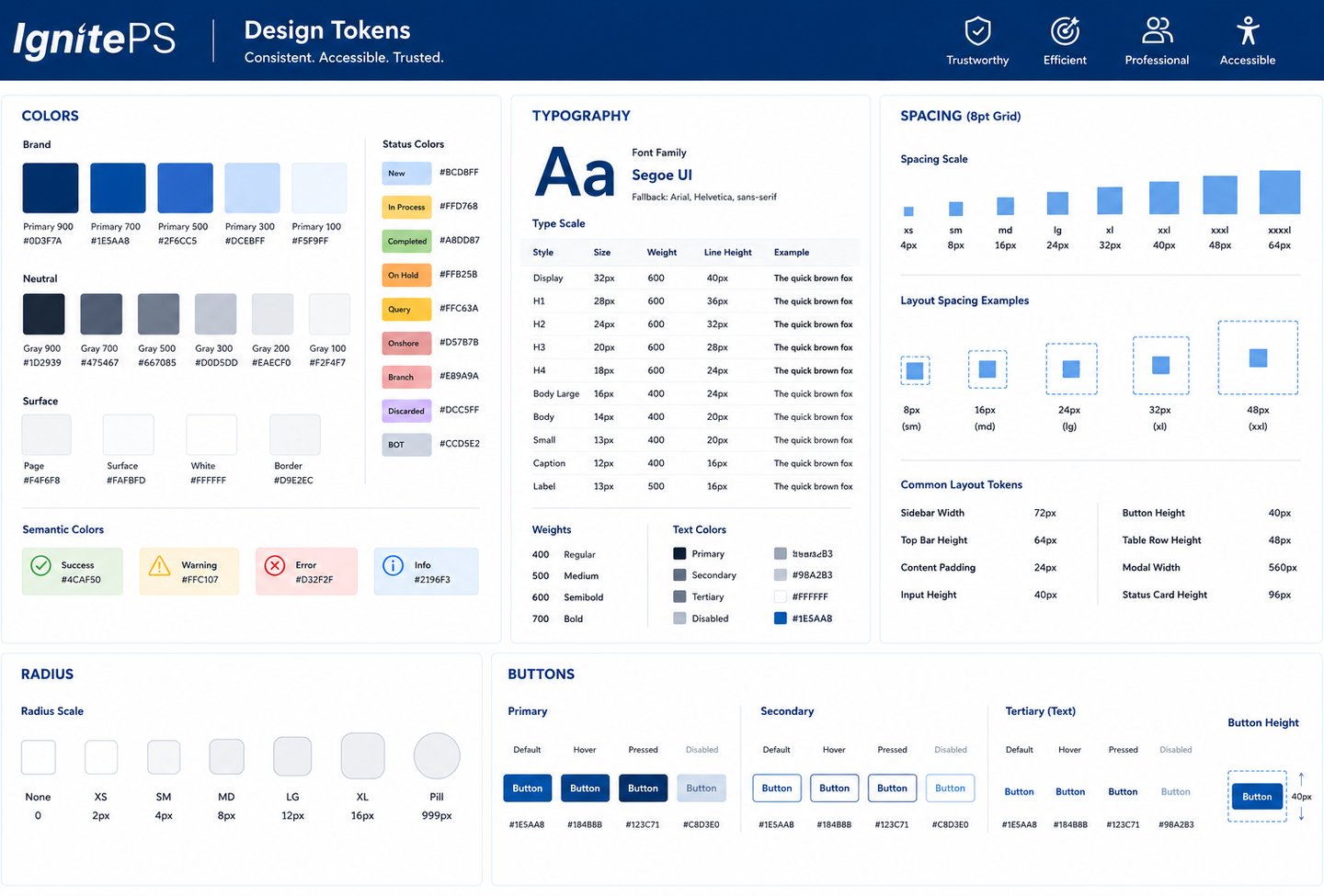
I applied the FA Design System tokens throughout this design to maintain consistency across colors, typography, spacing, borders, shadows, shapes, and the overall visual language.
BRAND GUIDELINES
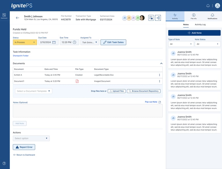
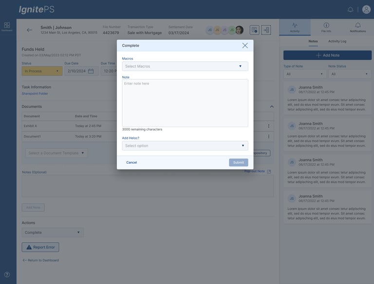
Once the initial low-fidelity wireframes were shaped and aligned with user requirements, I collaborated with the team to review and validate the approach before moving into high-fidelity designs. This helped ensure alignment on functionality, user flow, and business goals early in the design process
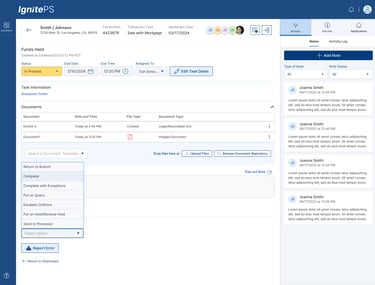
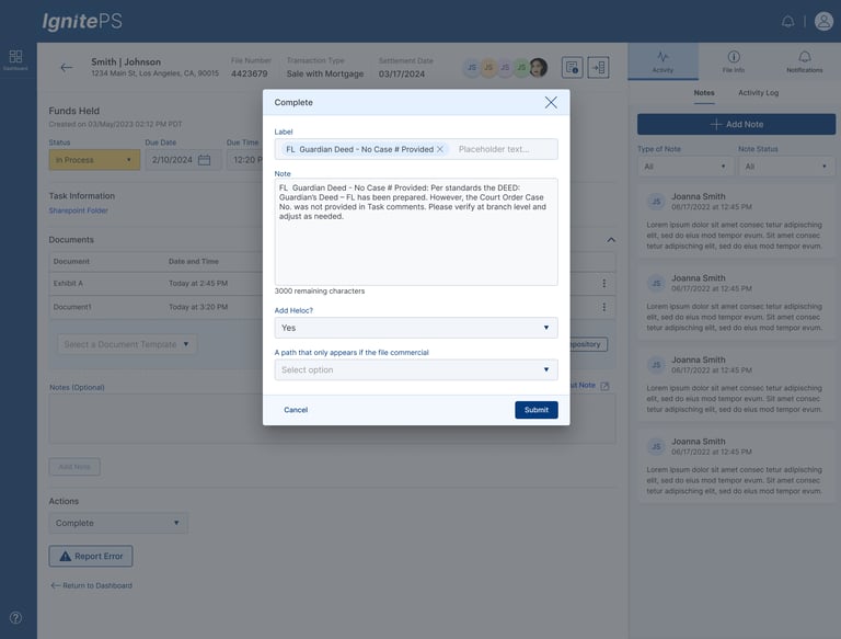
HIGH-Fidelity WIREFRAME & PROTOType

3.IMPROVEMENT AND IMPACTS
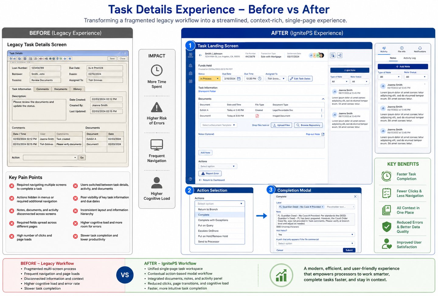
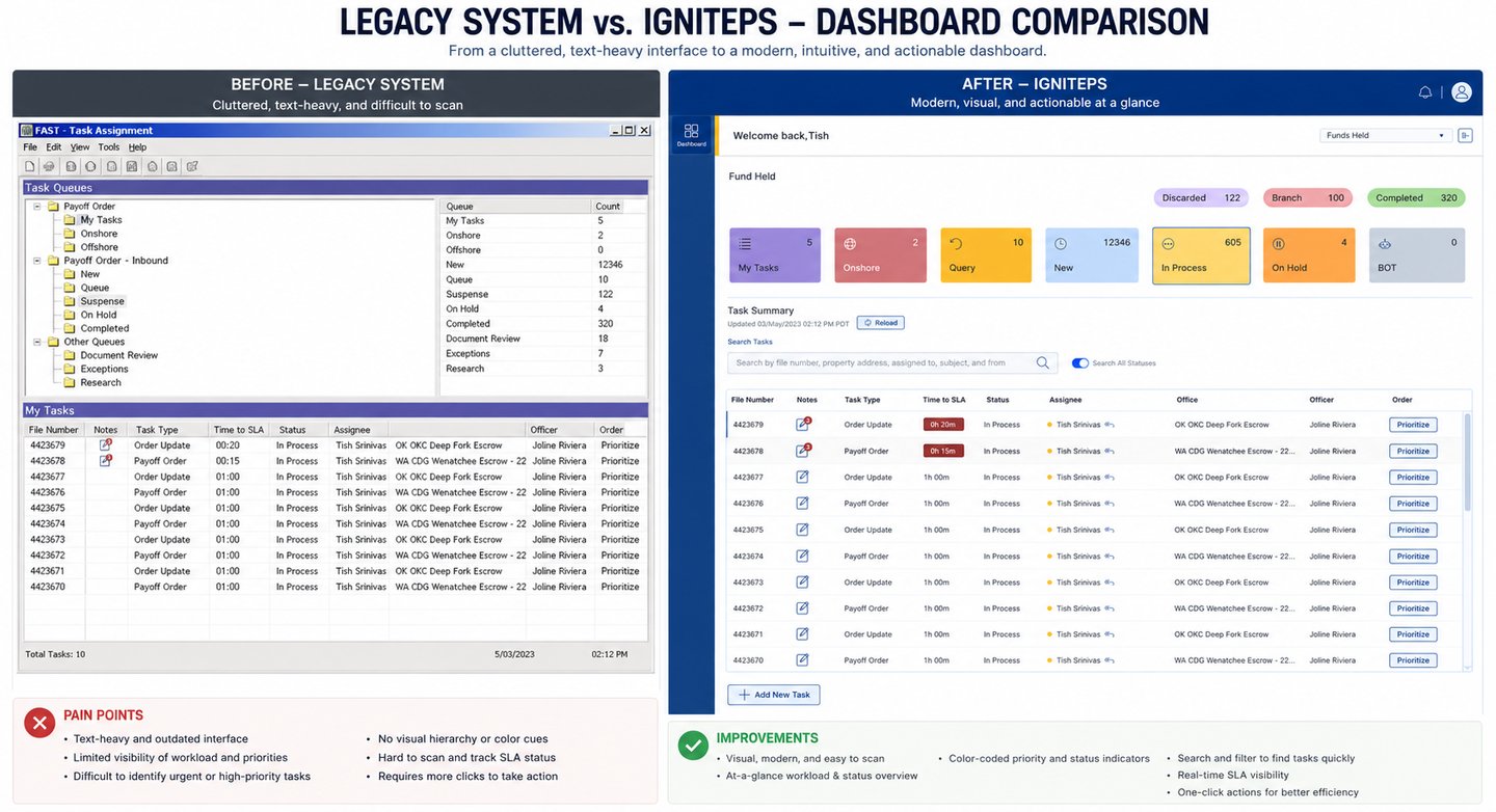
BEFORE VS AFTER (EXPERINCE SHIFTS)