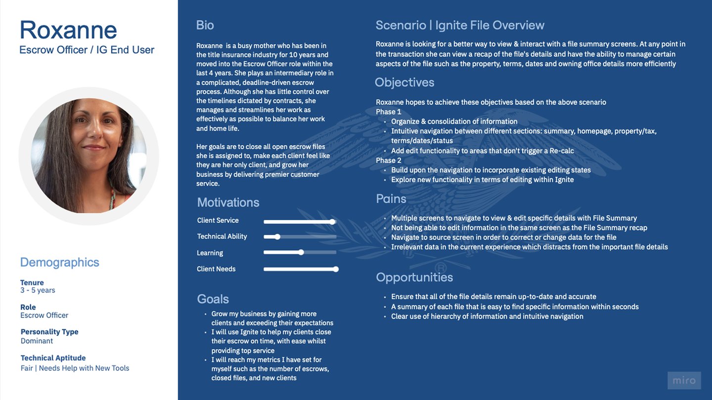
File Overview Redesign
Background
An escrow officer is a professional who manages the financial and legal details of a transaction most commonly in real estate to make sure everything is completed correctly and securely.
On a daily basis, escrow officers handle highly complex files that combine property details, financial transactions, legal documents, and business information. They continuously navigate, verify, and update this interconnected data to ensure accuracy, maintain compliance, and keep transactions moving smoothly throughout the entire escrow lifecycle.
Goal
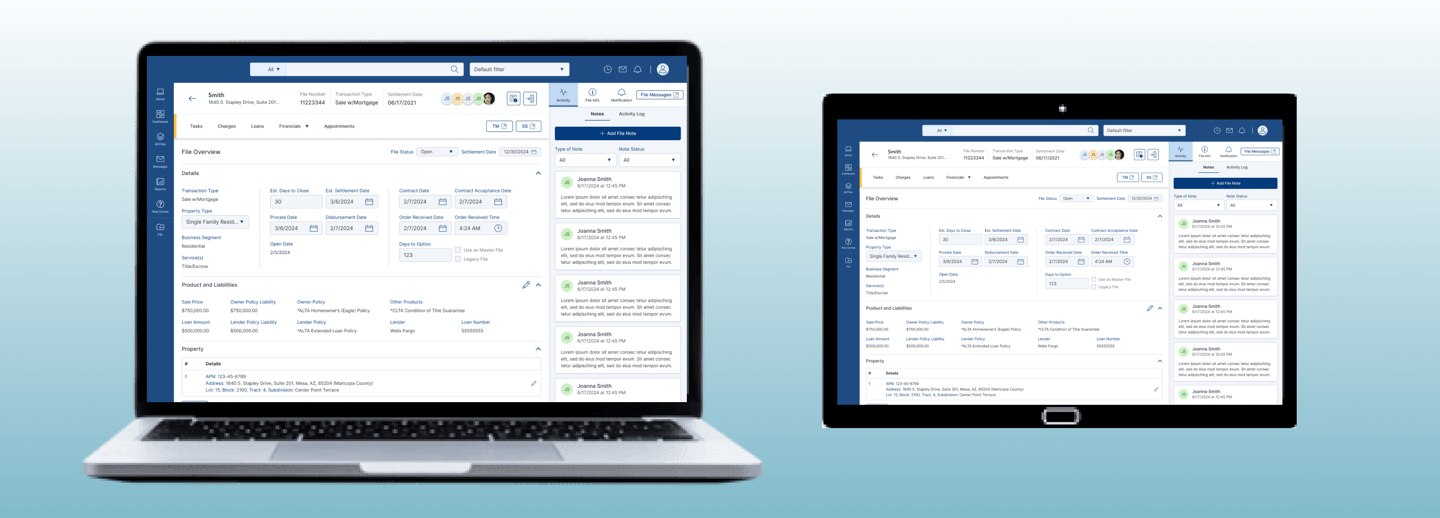
Redesign the File Overview page to give escrow officers quick, centralized access to critical file details, reducing the need to navigate across multiple screens after file creation. This standalone screen within the Escrow application consolidates Terms & Dates, Status, Property Tax details, File Summary, and the File Homepage from the legacy system into a single, unified view for more efficient file management
Escrow Application Design

Defined UX problem statement
Led discovery interviews
Synthesized pain points into actionable insights
Created journey mapping for current state
Designed structured File Overview layout
Role: Lead UX Designer
Product: Escrow Platform
My Contribution
My Role
Discovery and Research
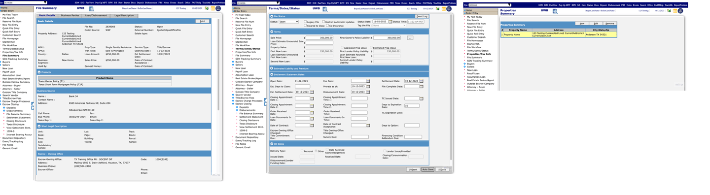
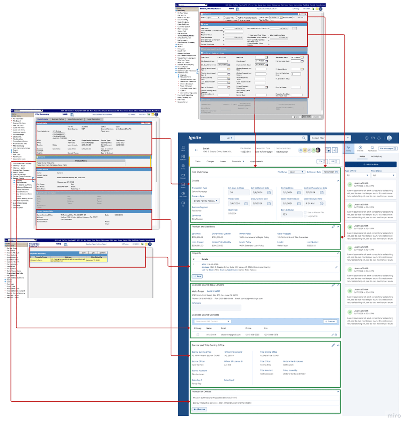
Audit old system
The following screenshots, captured directly from the legacy system, document the baseline experience. They served as the starting reference for every design decision that followed.
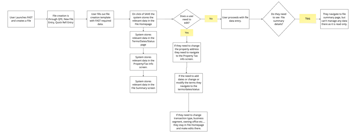
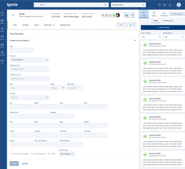
Currently, Escrow Officers are forced to navigate multiple redundant screens to view and manage critical file information — property details, terms, settlement dates, and office information — because the legacy system was built around technical structure rather than user experience. This fragmentation creates confusion, slows workflows, and surfaces irrelevant data that doesn't serve the division's actual needs. The problem compounds over time as added functionality never addressed logical flow, making the system especially difficult for new users to learn and navigate efficiently.

Current state and pain points
Why is the problem important to solve for?(risks)
Saves the end user time by eliminating redundancy and increasing efficiency. Consolidating these screens would eliminate unnecessary fields, logically display related data and show file data in a summary format that would create a better user experience and flow.
User Interviews
Interviewed Escrow Officers (new and experienced users)
Conducted contextual walkthroughs of the File Summary experience
Observed how users navigate between:
File Summary
Terms/Dates/Status
Property/Tax Info
File Homepage
Identified natural workflow behaviors and friction points
Used probing and reflective questioning
Key Findings
Users frequently navigated 3–5 screens to verify basic file details.
Property and owning office information appeared in multiple places without a clear source of truth.
Information was not logically grouped, mixing financial, legal, and office data.
Users were confused about what could be edited, where updates should be made, and whether changes would sync
Users relied on memory rather than system guidance to locate accurate information.
Current Journey Mapping
Future Journey Mapping
DESIGN MOCKUPS
NEW DESIGN PROPOSALS
FINAL DESIGN SOLUTION
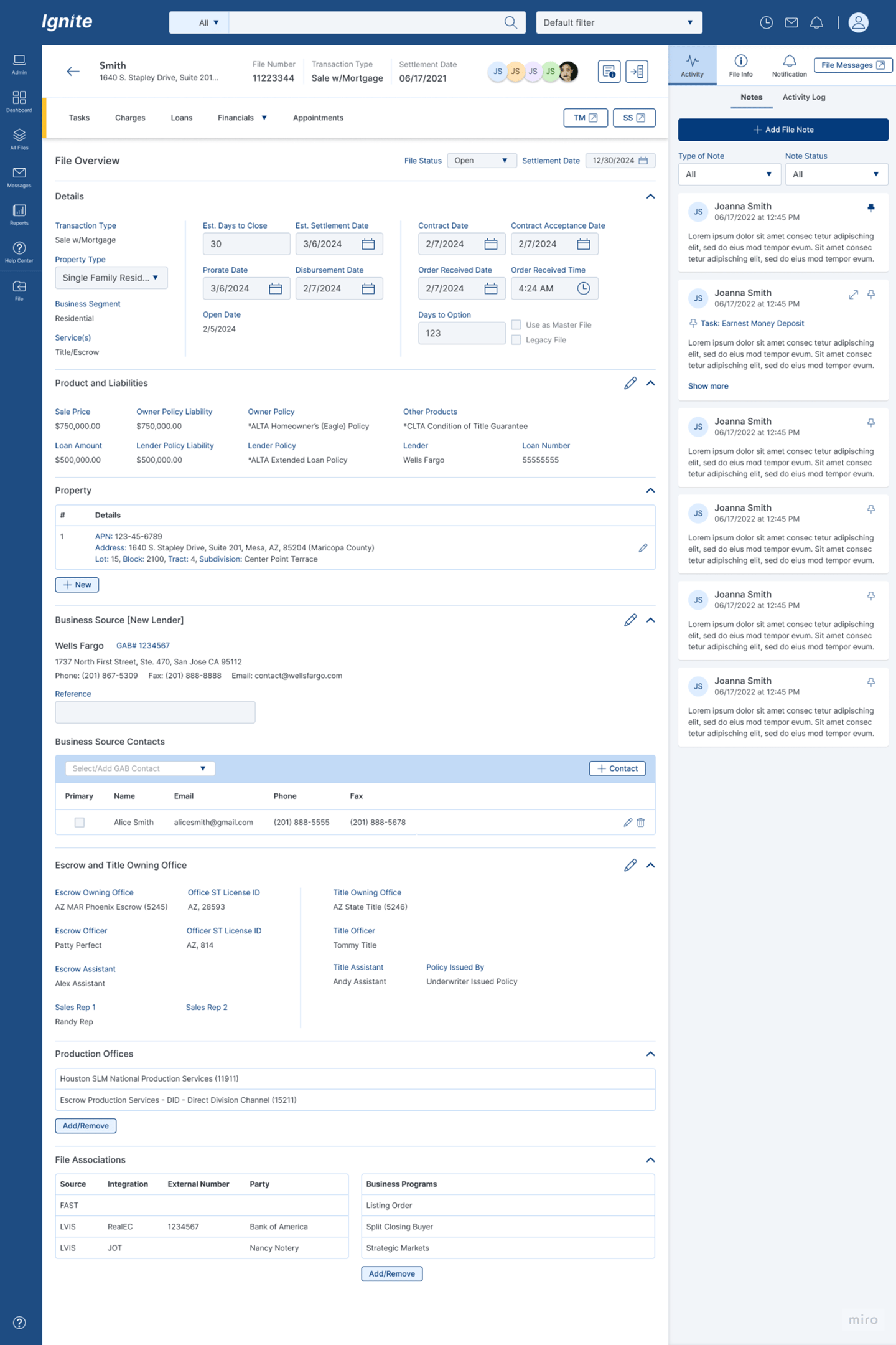

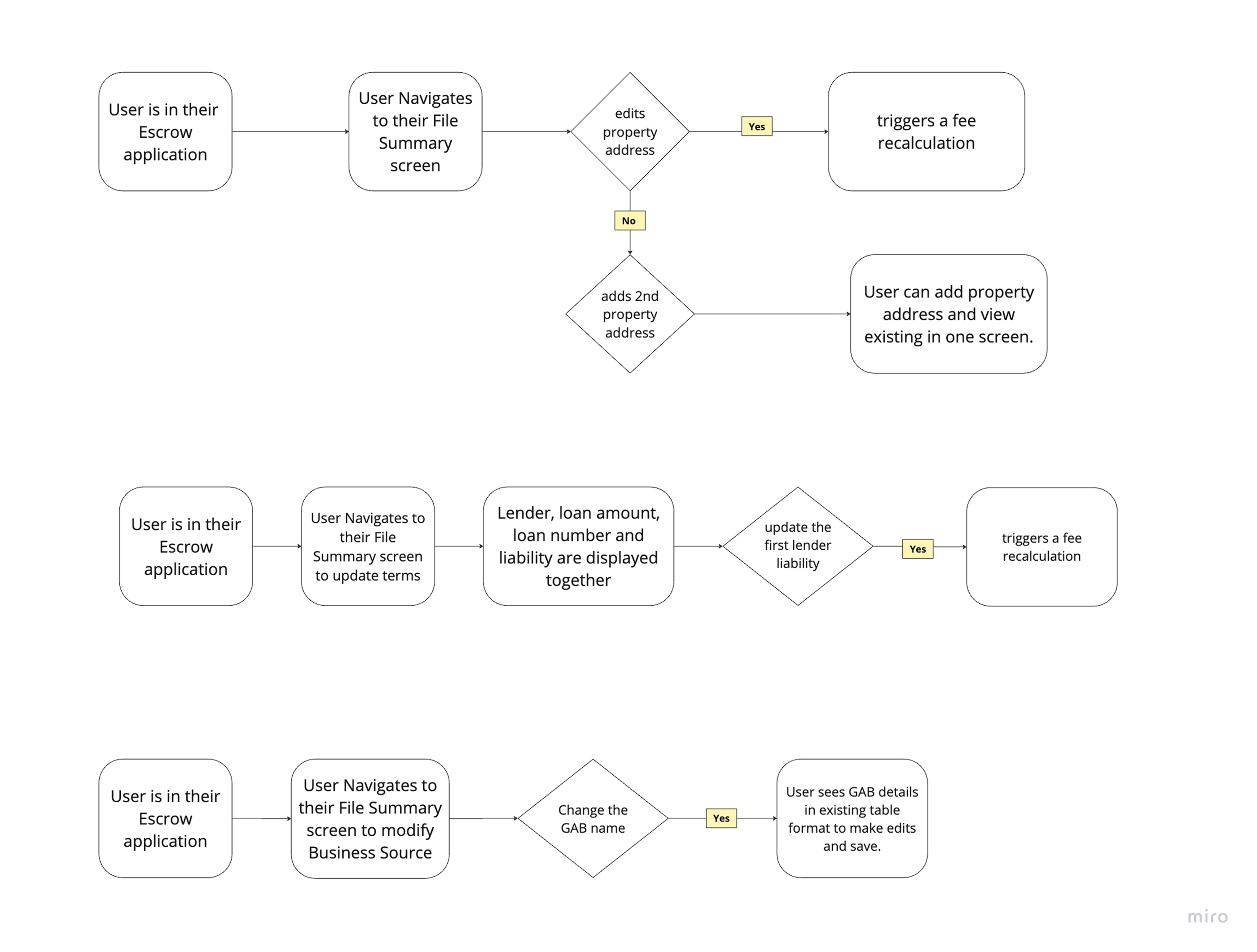
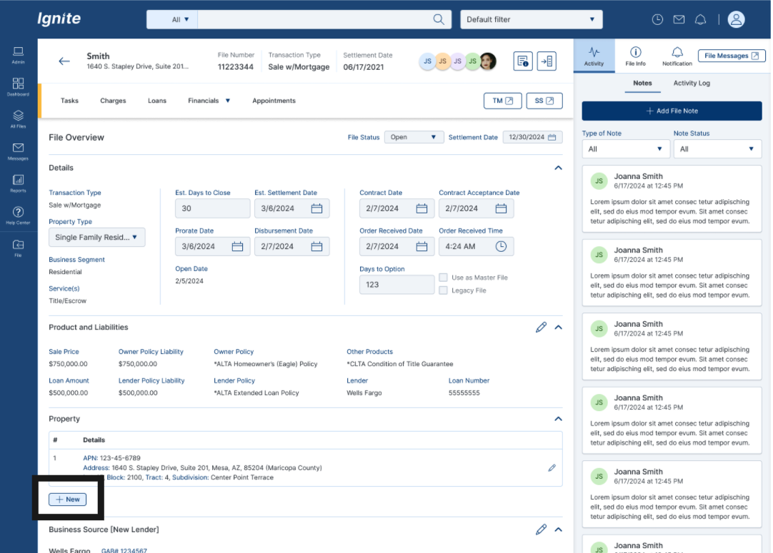
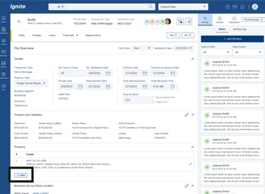
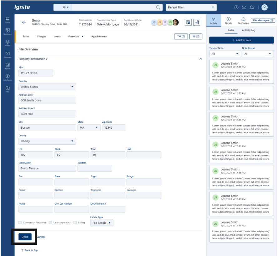
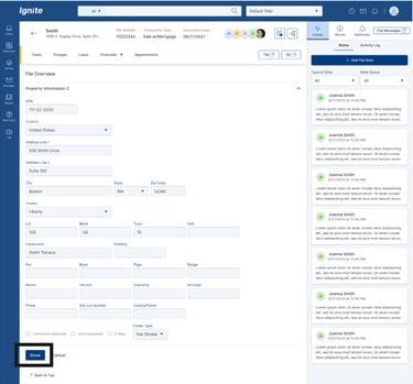
FLOW1- ADD NEW PROPERTY

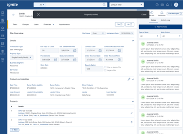
FLOW 2 - PRODUCT AND LIABILITIES - Add Second Owner Policy
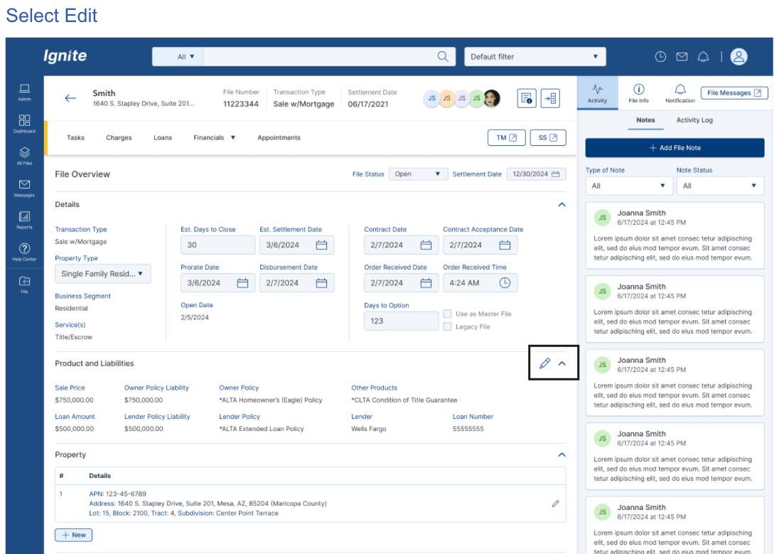
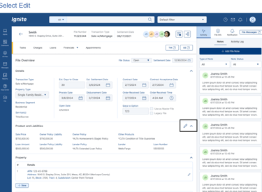
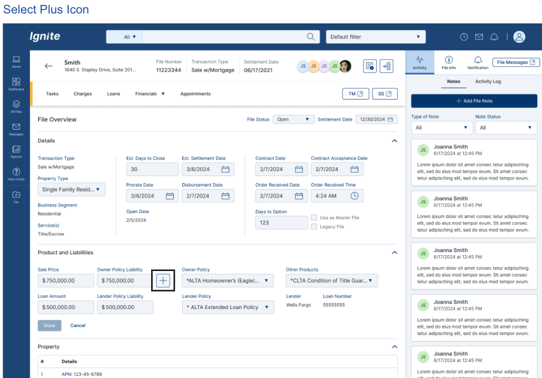
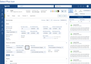

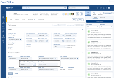
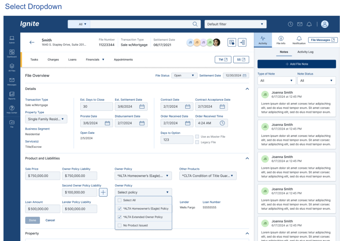
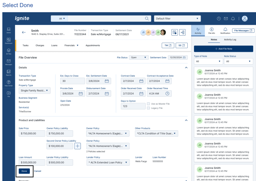
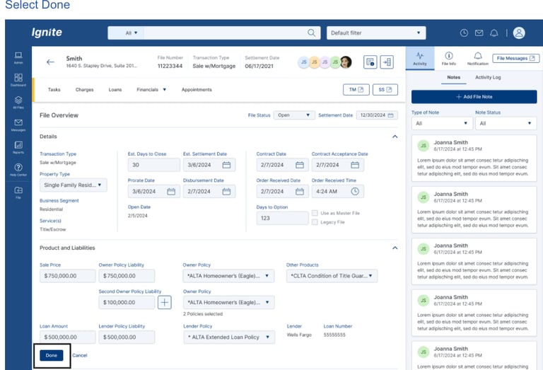
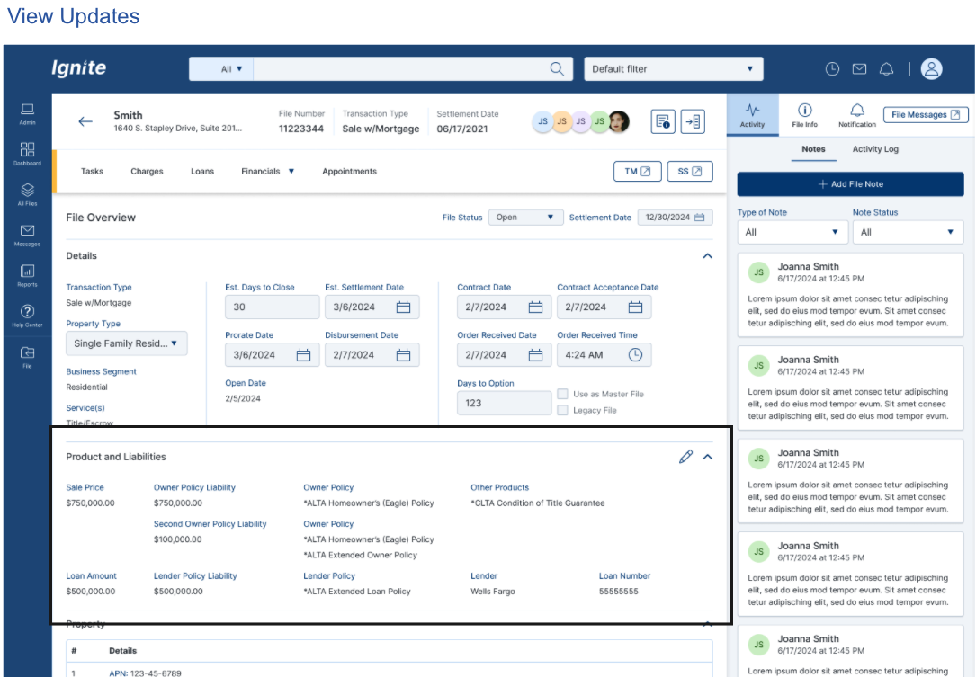
I worked with product managers and stakeholders to identify redundancies, define what should be considered in the new design, and move forward with the redesign.
IMPROVEMENT and Impacts
BEFORE VS AFTER (EXPERINENCE SHIFT)
Consolidated summary layout
Reduced duplication
Defined data hierarchy
Information scattered across multiple screens
Users navigated between File Summary, Terms/Dates, Property Info, Homepage
No clarity on where authoritative data lived
After
Before
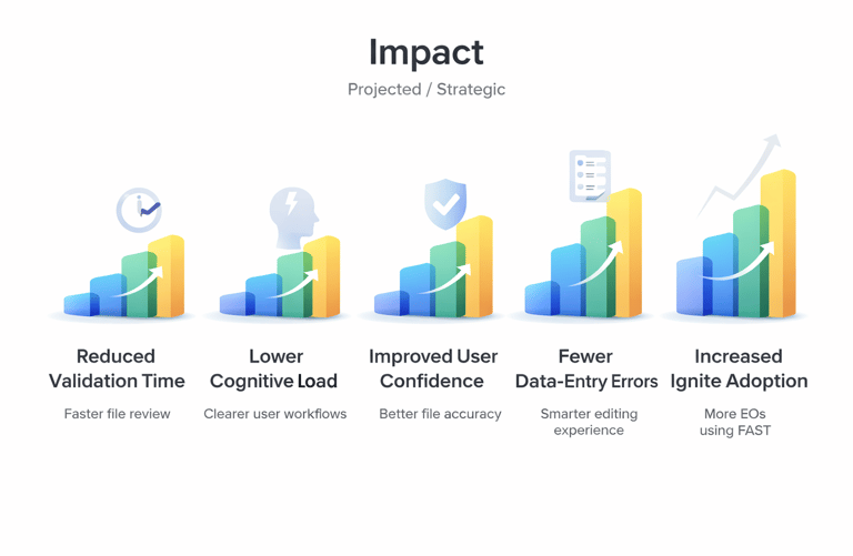
EXPECTED IMPACT
Reduced file validation time
Lower cognitive load
Improved user confidence
Increased efficiency across file lifecycle
Better experience for new hires