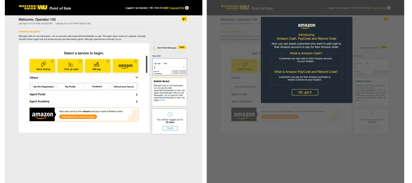
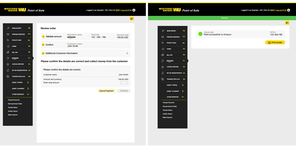
Amazon Paycode
Payment in Western Union location (Buy global, pay local)
Overview
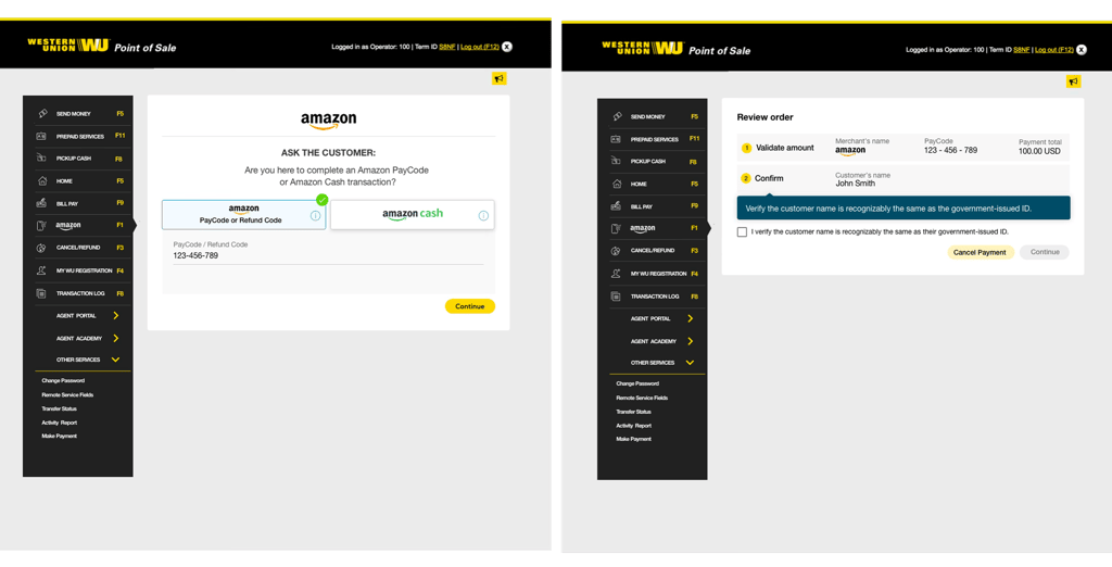
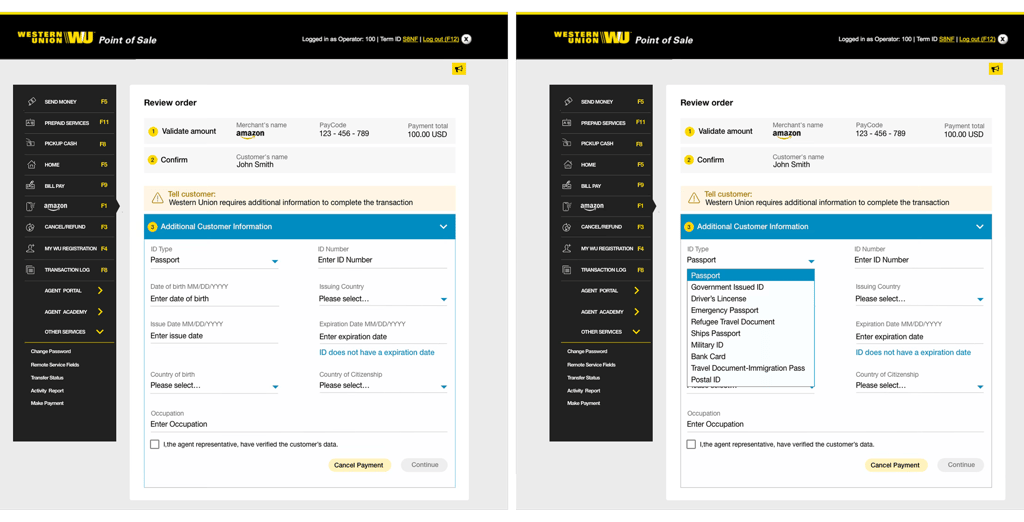
Amazon PayCode is a new payment option that enables to pay for Amazon orders with cash. User can shop online and pay at a participating Western Union® agent location nearby. Once paid Order will ship to address specified at checkout.
GOAL
Improved the existing user experience by simplifying user flows, removing unnecessary content, and creating a more immersive and streamlined money transfer experience.
Define the scope and technical limitations, as well as figure out ways to efficiently utilize the limited resources and budget. Most importantly make the the experience simple and adaptive that agent don't need any initial training before using the application.
Discovery and Research
ObServation and pain Pont
The first step I took was to do a field visit by visiting the western union agent location and conducted interview with agents(users) who are serving customer from many years. Based on user interview I captured some of the following pain points.
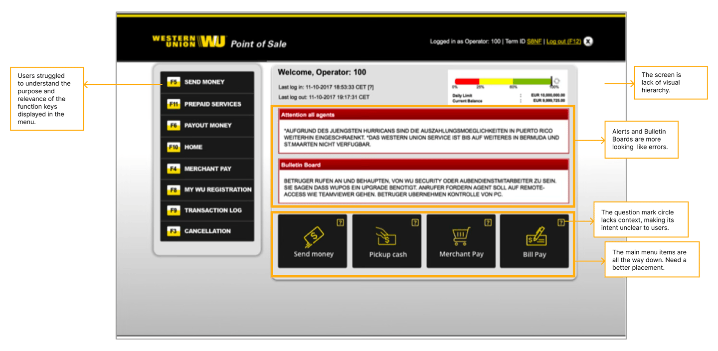
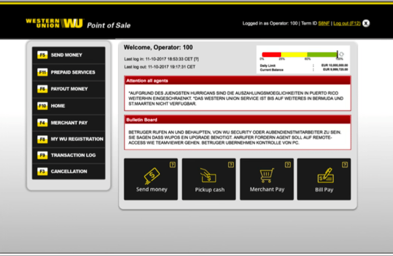
The screen lacks a clear visual hierarchy, making it difficult to scan important information.
Key content does not stand out, reducing usability and increasing cognitive load.
Alerts and Bulletin Boards visually resemble error messages, causing potential confusion.
Main navigation is placed too low on the page and should be repositioned for better visibility and accessibility.
Users struggled to understand the purpose and relevance of the function keys displayed in the menu.
The question mark circle lacks context, making its intent unclear to users.
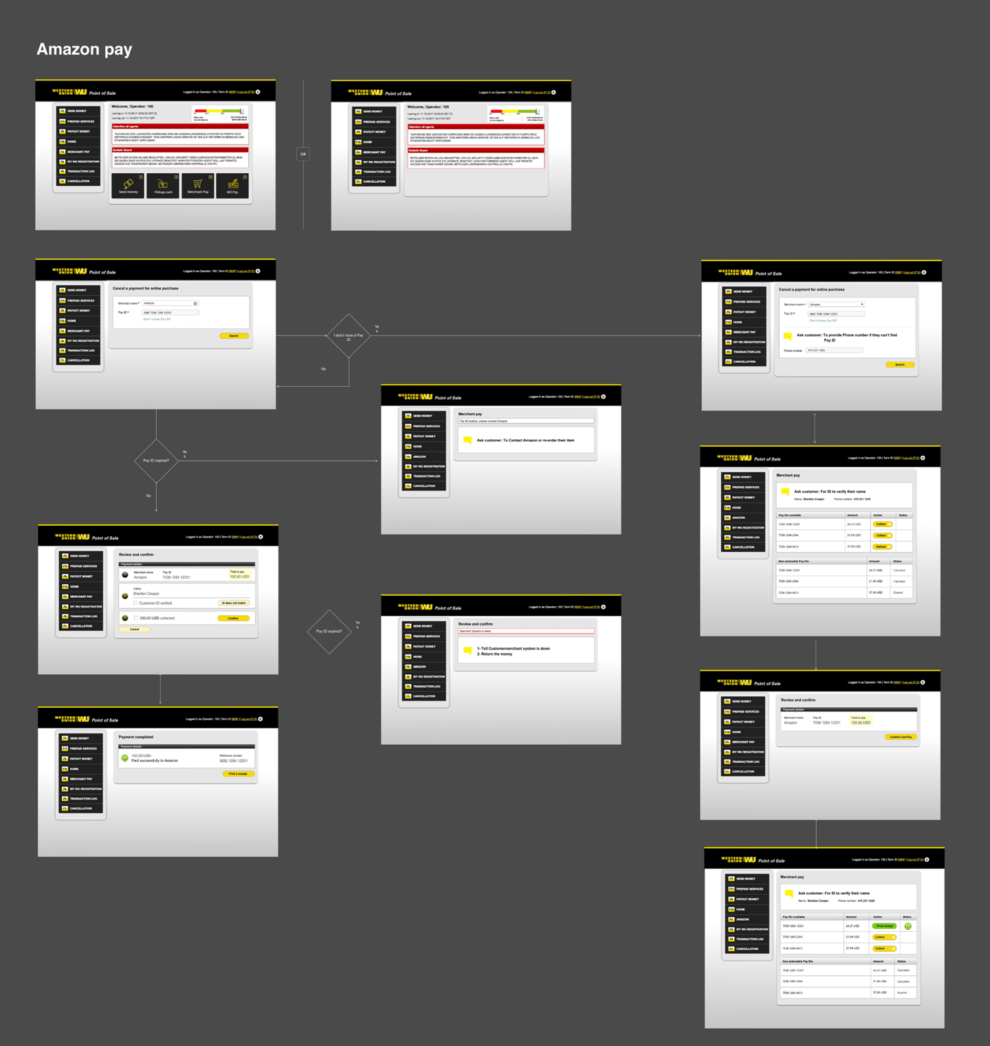
AUDIT THE CURRENT FLOW
To gain a holistic understanding of the user experience, I organized the existing design into a clear and concise user flow.
IDEATE and CREATe
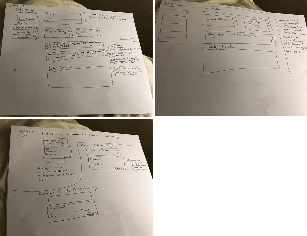
BRAINSTORMING and SKETCHES
The next step was to discuss insights, brainstorm potential solutions, and sketch ideas on paper to quickly explore and validate concepts before moving into detailed designs.
High-Fi mockups
Based on the research insights and brainstorming sessions, I created low-fidelity mockups for stakeholder review. This helped gather early feedback, align on design direction, and iterate quickly before development, reducing rework and minimizing implementation risks.
Validate and Results
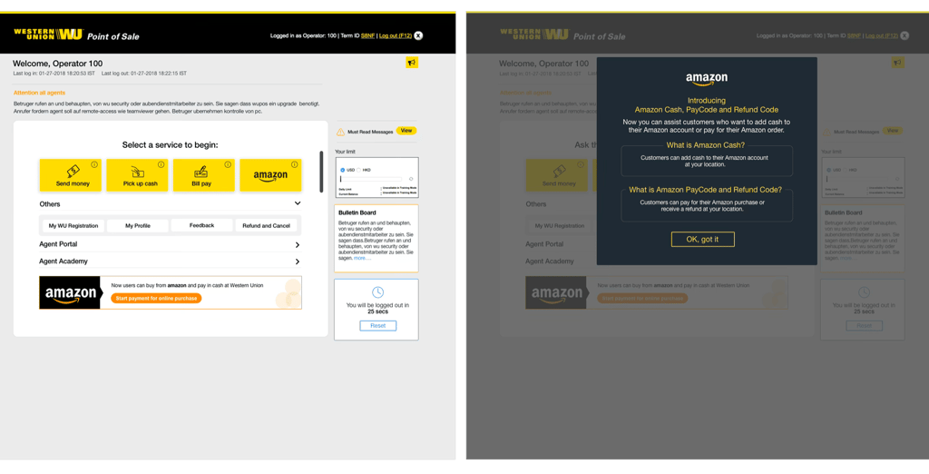
Before
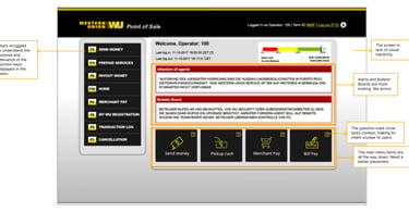
The screen is lack of visual hierarchy.
Alerts and Bulletin Boards are more looking like errors.
The question mark circle lacks context, making its intent unclear to users.
The main menu items are all the way down. Need a better placement.
Users struggled to understand the purpose and relevance of the function keys displayed in the menu.
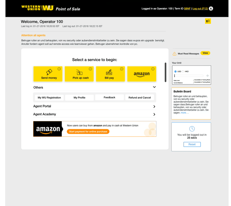
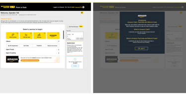
AFTER
Improved Visual Hierarchy – Primary services such as Send Money, Pick Up Cash, and Bill Pay are now prominently displayed, making it easier for users to identify key actions and start their tasks quickly.
Reduced Alert Fatigue – Alerts and bulletin board messages no longer resemble critical error messages. Their updated styling helps users distinguish informational content from actual system issues.
Better Placement of Main Actions – Frequently used services are moved to a central, highly visible location, reducing the need for users to search through multiple navigation areas.
Clearer Navigation and Information Architecture – Content is organized into logical sections (Services, Others, Agent Resources, Messages, Limits), improving scanability and helping users find information faster.
Removed Function Key Confusion – Replacing function-key-based navigation (F3, F4, F5, etc.) with descriptive labels and icons makes the interface more intuitive and easier for users to understand.